How can one update their main floor bath in both an economical and resale worthy way?
Well, the first thing you have to determine is what is outdated or a drawback in one way or another. It could be outdated coloring, unappealing wallpaper, outdated fixtures, a cheap vanity, unimpressive mirror, or lighting. It could be the layout is not logical or functional.
Figuring out what must go and what can stay is the first step.
Determining what kind of a budget you want to spend is the next. After looking at average costs, I would say we went no where near the $2000-$9000 average.
We cannot always do everything at once, and sometimes changing things does not increase the value, especially if it isn’t done nicely or with common sense approach.
Sometimes we can use our existing things and improve them with paint and a few inexpensive improvements.
Walls
Let’s start with the walls. If you have a color that’s not neutral, for example: bright purple, hot pink or neon green. Or if you have outdated wallpaper like ivy, huge flowers, a pattern with geese, or large stripes, none of these will appeal to the masses, and it’s time for it to go.
This would be the first thing to change. That being said, removing wallpaper is no joke. There are some techniques and tools out there to simplify the job though.
If you have a lot to do, it may be worth investing in a steamer. I recommend starting with a corner of the wallpaper and trying to work your way down. It doesn’t always come off easily and usually requires scraping, washing, and is basically a messy job no matter what. I have found it to come off easier if it is wet first.
When picking a wall color, pick something that is neutral, or a shade of white, and you’ll definitely be safer for resale in this regard.
If you’re picking for yourself, and it’s not for resale purposes, then go ahead and pick whatever brings you joy.
If I were picking a wallpaper for my bathroom, and I didn’t need to worry about resale, I would likely pick something like malachite wallpaper or a charcoal gray paint or even antiqued mirror tiles.
I’m a little more adventurous when it comes to my personal taste, but if I’m picking for resale purposes, then I am going to choose something pretty safe and neutral.
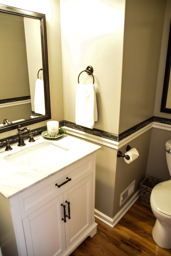
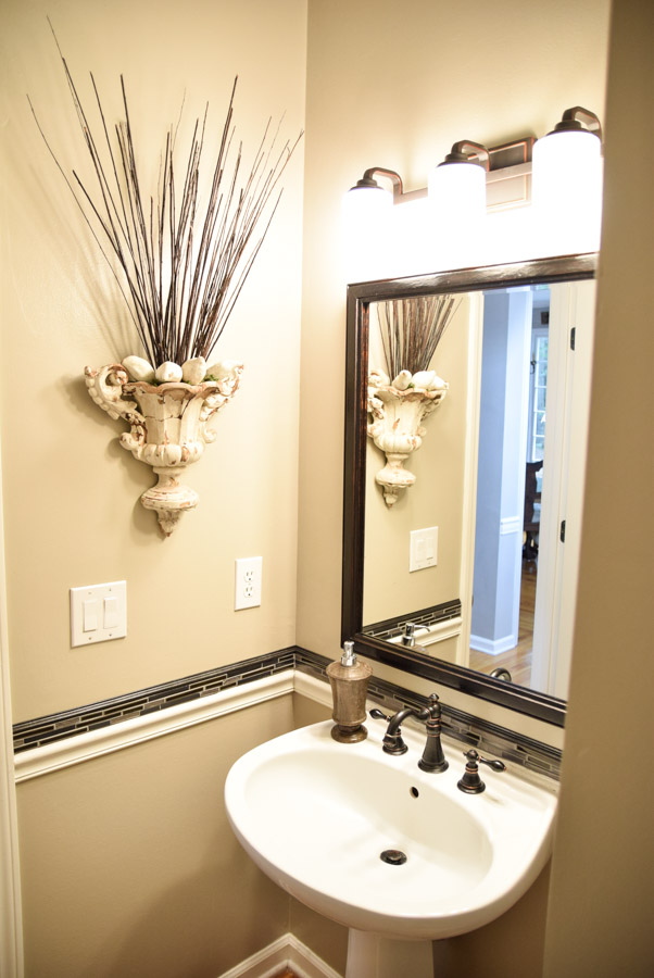
In my case, my walls were already a taupe / gray color, which happens to be a popular color these days. I chose to not change it, other than to repaint in a semi gloss instead of flat. I also had a white chair rail in the bathroom that matched the other areas of my house, so it worked well as far as uniformity is concerned.
My house was relatively updated when we moved in, so we didn’t need to do a lot, other than embellish and improve little things.
I’m going to give some examples of what you might need to do if yours has not been updated.
Faucets
Outdated faucets could be identified as either very polished gold-colored or any of the ones with plastic handles, both would be considered out of style.
You now can find modern, sleek designs in brass, brushed nickel, bronze, black, and even polished chrome. So pick something new and fresh. It will be clean, free of sediment, and function better.
Also, today’s modern faucets offer all kinds of extras- motion censored, tall, waterfall style. Literally tons of options and styles to choose from at every price point.
Also, Home Depot does daily deals and frequently put on faucets. These are usually online only, but some good deals are to be had.
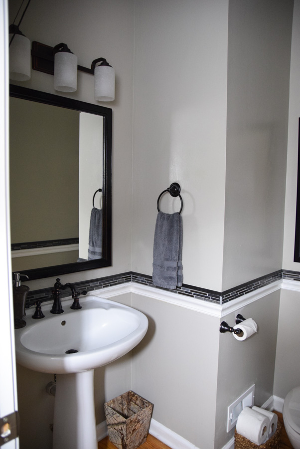
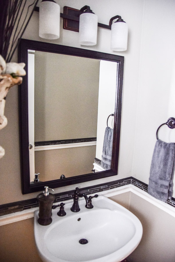
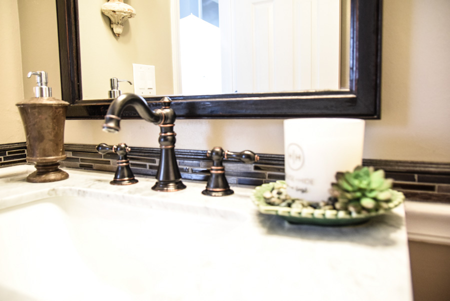
Ours were bronze and recently updated, so we kept them and matched our other updates with them.
Mirrors
Many times mirrors are either too small, cheap looking, builder’s grade, or outdated. I recommend having a mirror that fits the space. Not overextending the vanity greatly or way too small either. Could be simple or ornate. Just have it look nice with the other elements you’re choosing.
If you do have a builder’s grade mirror, you could just add a coordinating frame to it and it will spice up the room.
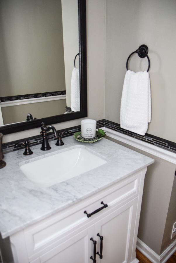
In our case, we wanted to have our bathroom look modern but with a classic vibe. We ended up adding an antique beveled mirror that we re-stained black.
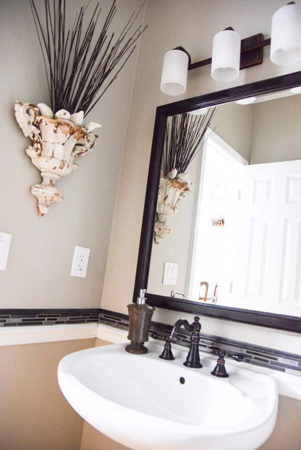
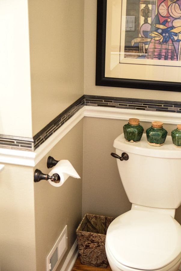
It was about the same size of a Picasso print I have hanging in there, so the two pieces balanced each other nicely.
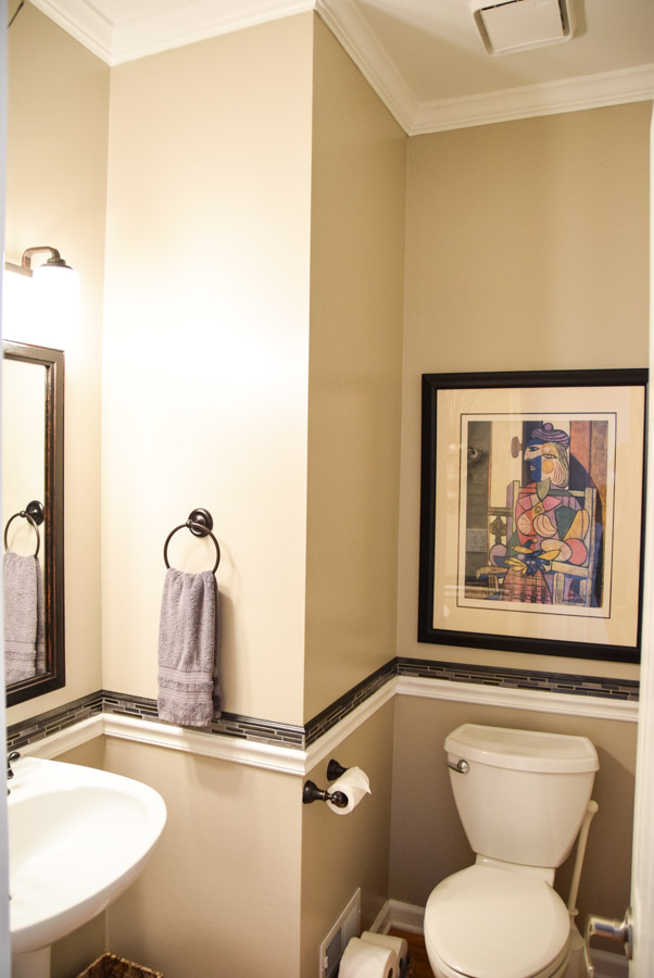
You can see by looking closely, the mirror still has some of the cherry wood peeking through, matching the copper peeking through in the bronze fixtures.
Sink
Some homes’ main floor bathrooms come with a small pedestal sink. You know the kind where you can’t even lay your toothbrush on it without it falling into the sink. Not very conducive for guests, or for storing any other unsightly items.
This is exactly what we had. We were going to work with it, and leave it in place, but I got a little bug.
I decided it would be more practical to have an actual vanity in there.
Now, if we knew we were staying in this home for a longer time, I would have personally put in a different piece. It could have been a repurposed dresser or a floating vanity, or a table that I added a vessel sink to. Those would have been my first choices.
I had been on the hunt to find a vanity that would work in the space, and be easy to install, as the pipes were going up through the floor and not the back of the wall.
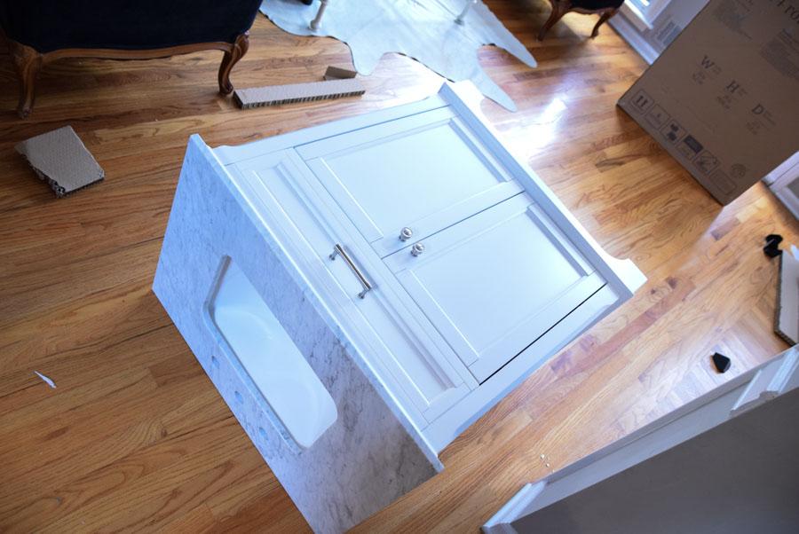
I had searched the FaceBook Marketplace and ended up finding a basic white vanity. It didn’t come with a sink or faucet though.
Well, when I tried to find a nice sink to fit, the cost for a sink with a marble counter was about $250 and up. A plain shallow plastic one was around $129. I decided at the end of the day, I could pick something nicer for close to the same cost.
I happened to walk by the clearance vanities that Lowe’s had on display. They had complete vanities ranging from $250-$400 in the size I was looking for. Anyway, both my hubby and I liked this one best.
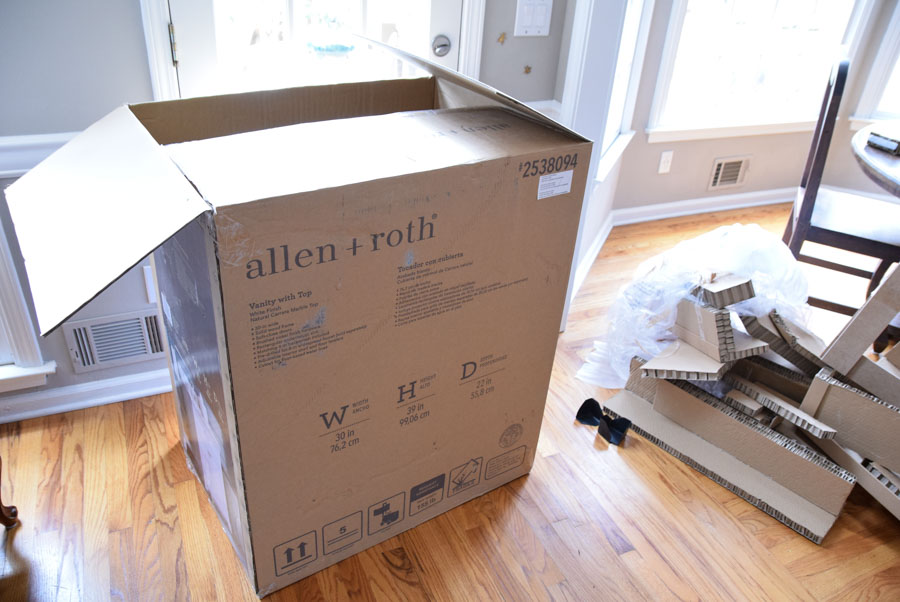
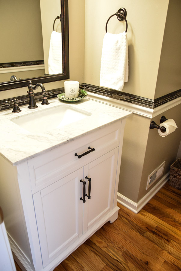
We paid $350 which was originally significantly more. It’s modern, put together, and has an opening at the base for either type of install, which made it a win for us!
Installing the Vanity
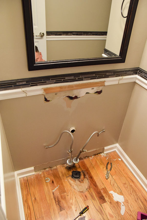
The first thing that had to be done was to remove the old sink. Fairly easy once the water was turned off and everything was disconnected.
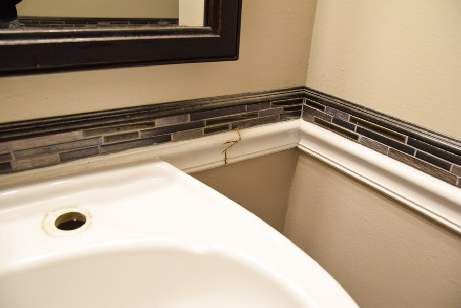
I didn’t want any damage to the tiles we had installed so we used an exacto blade to cut between the sink caulking and the tile.
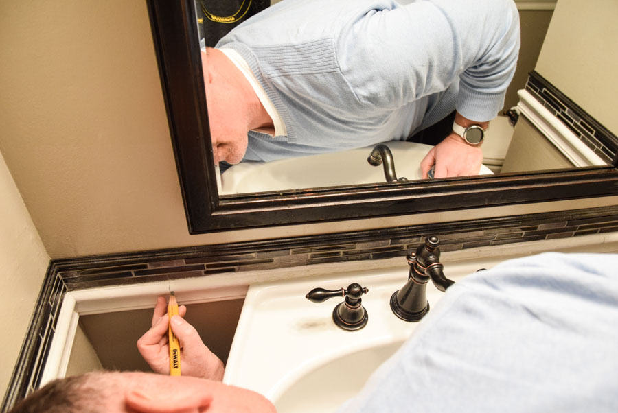
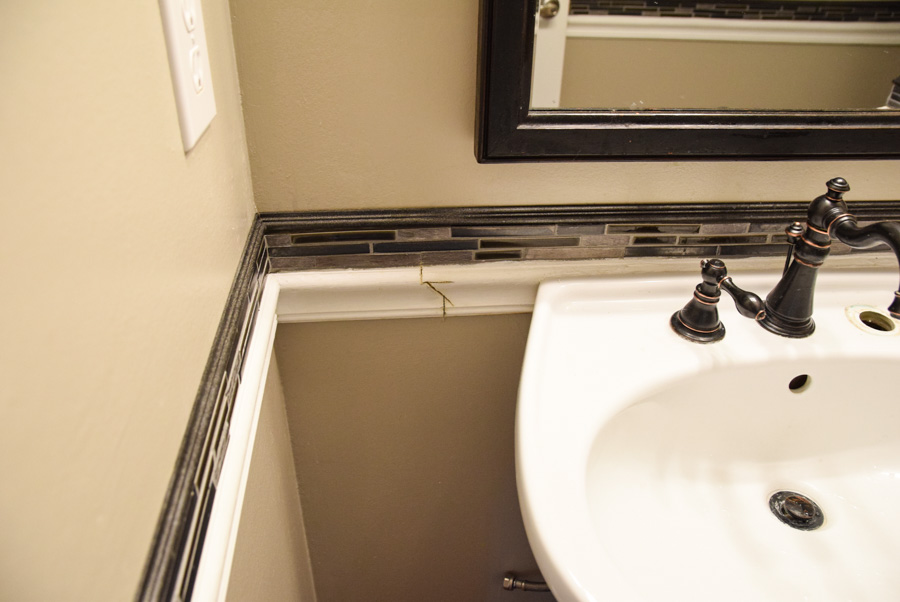
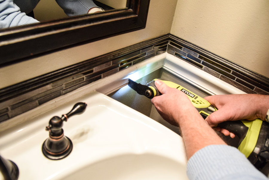
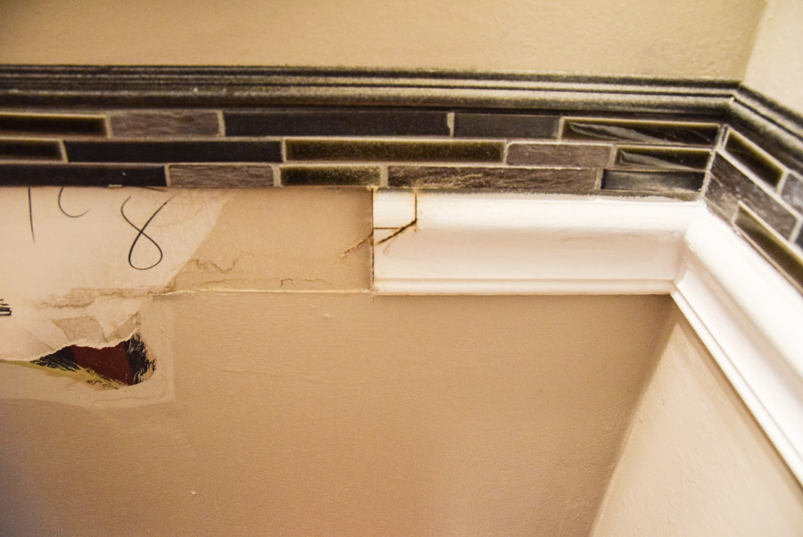
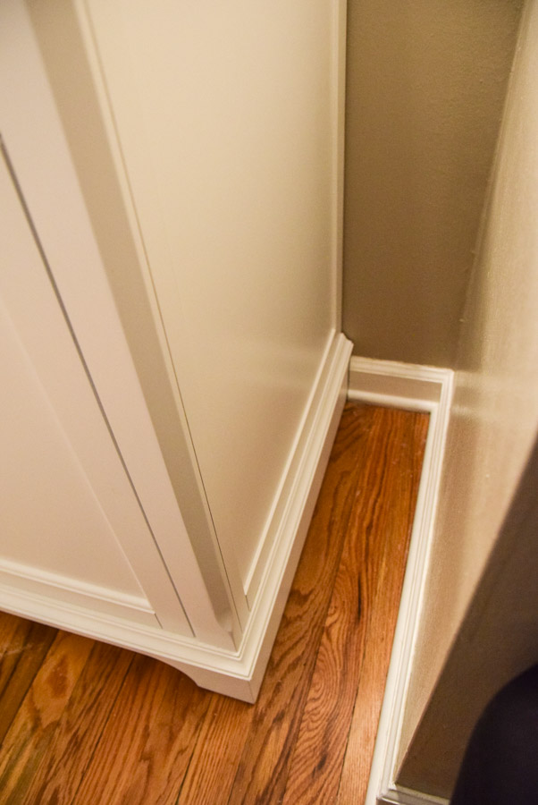
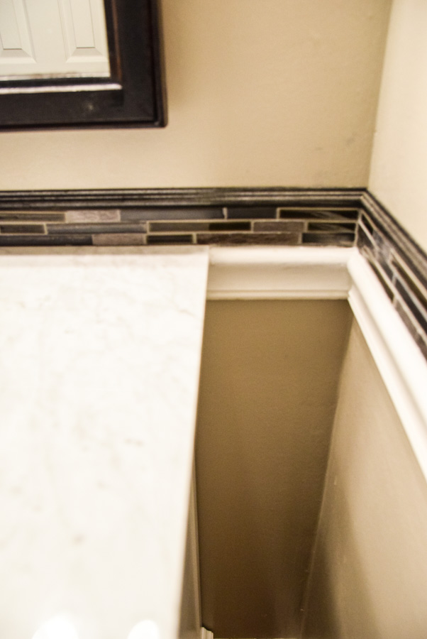
My hubby then measured and cut away the molding to fit the new vanity.
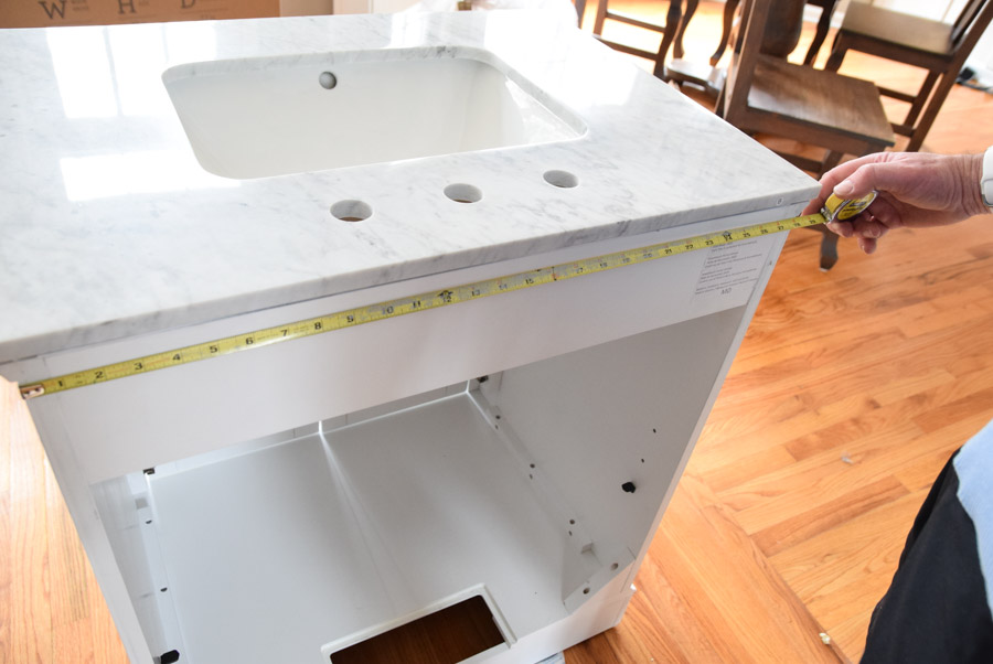
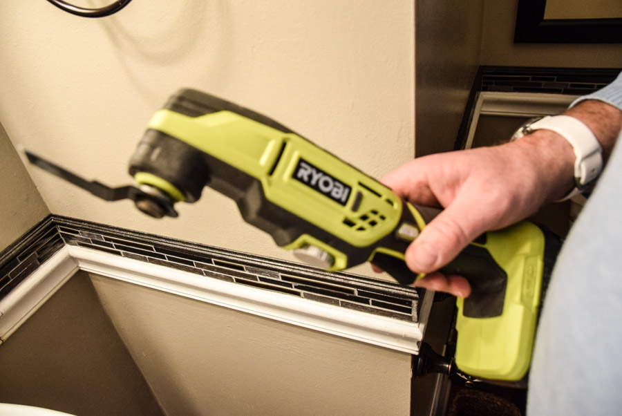
He used his new Ryobi multitool to cut all the edges perfectly. He did this by measuring and drawing it on the chair rail.
After the fact, he thought it may have been easier to use a paper bag, newspaper, or parchment paper to trace the outline of the vanity and draw it on using the pattern instead.
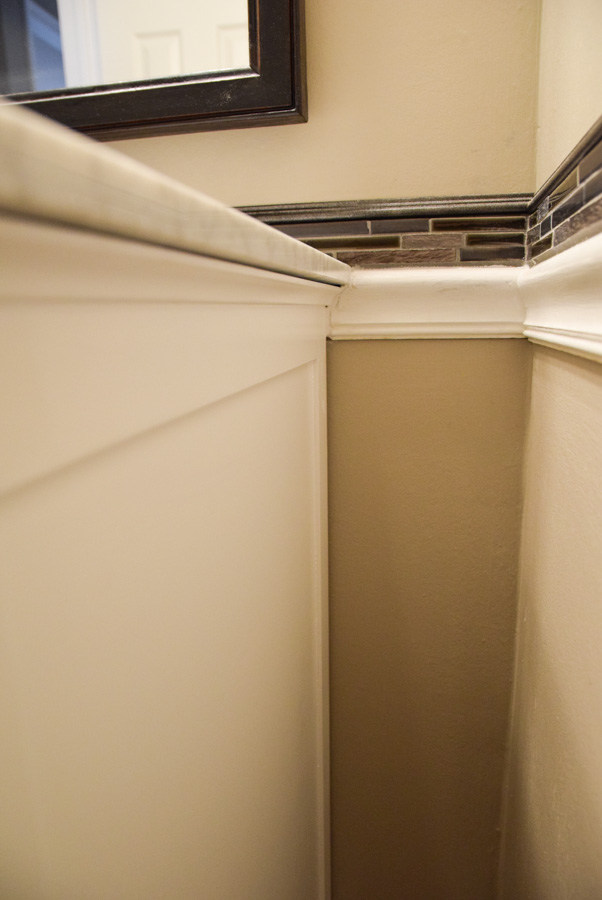
We moved the vanity into the bathroom, he lifted it up while I fed the pipes through the bottom hole.

Once he slid it in place, it fit like a glove! Impressive!
Like why only now, this year, did we get a multitool? We could have used this thing our whole lives! This is a truly magnificent tool!
Hardware
This vanity came with polished chrome knobs. In general, I’m not a fan of plain knobs. I personally like euro knobs much more.

The existing sink faucet and other hardware didn’t match perfectly with the straight euro knobs, so we picked something that matched better and yet was more our style. My hubby drilled holes in the cabinets to accommodate the new hardware.
When it comes to picking hardware, do some homework. There’s a huge range in price, quality, style, and color. There’s no harm in buying a couple styles and holding them in place to see what works best.
This is exactly what we did to determine what looked best. We’ll just return the others.
Also, I would check more than one source too. So many options and some places carry the same knobs at significantly different prices. So check around and read reviews.
Again, pick hardware that works with your style and matches your other things. It’s nice to have a harmonious room and not be all hodge podge.
Lighting
When it comes to lighting, there’s some pretty ugly options out there. If yours is not updated, I recommend changing this even if it means changing the electrical source from one location to another.
Have you ever seen an overhead light with chains hanging with balls suspended by hooks. Well if not, it’s one of the ugliest options out there. Eeeek! Or fluorescent tube bulbs on the side of a mirror? Yikes!
Anyway, modern lighting can be quite lovely. Tons of options for style, color, vibe.
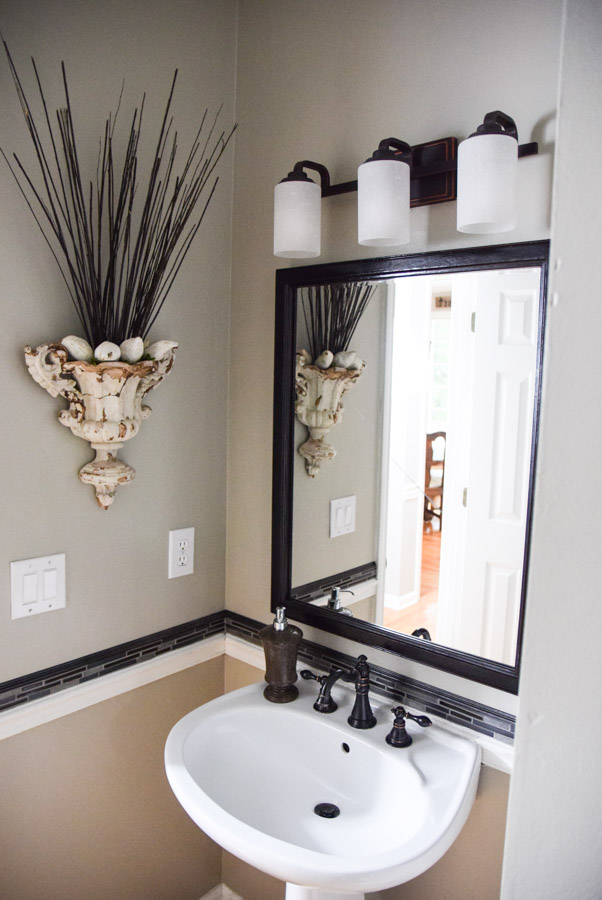
Many modern lights are more efficient too, now that LED’s are common. Even recessed lighting can really modernize a space. Pretty easy to install if you’re using the existing box too. Just match up the same colored wires while the power is off.
Tile Trim
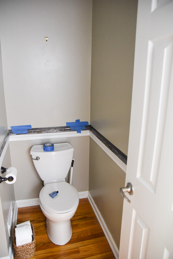
Before we decided to go ahead and do the vanity, We still wanted to give the bathroom a more classic vibe. We wanted to add a little something to make it a little more special.
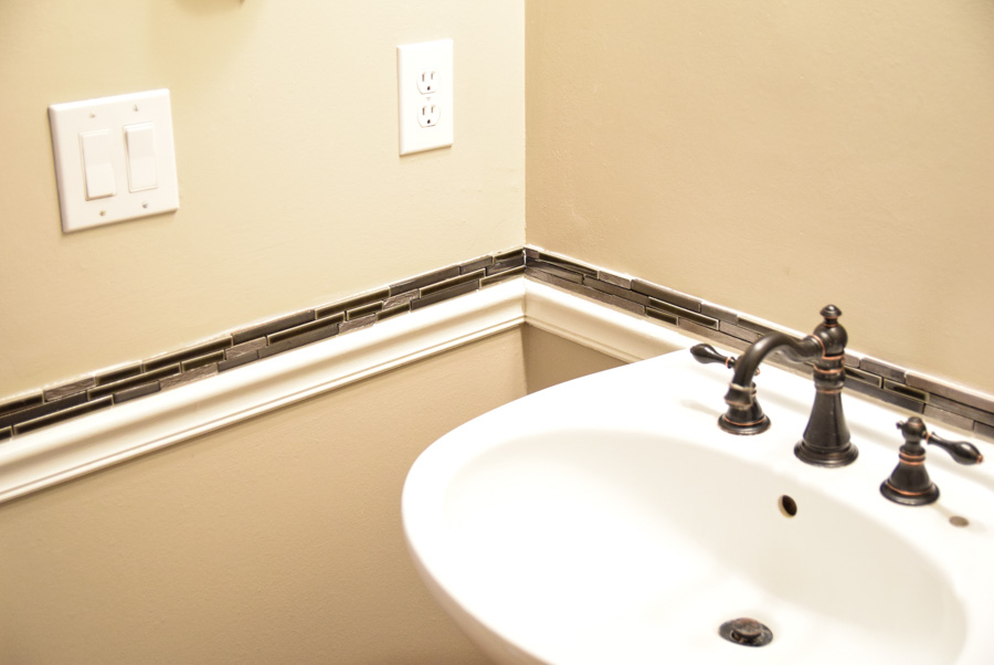
Since we had bronze accents on a fairly neutral space, I thought we could spice it up with a little tile trim.
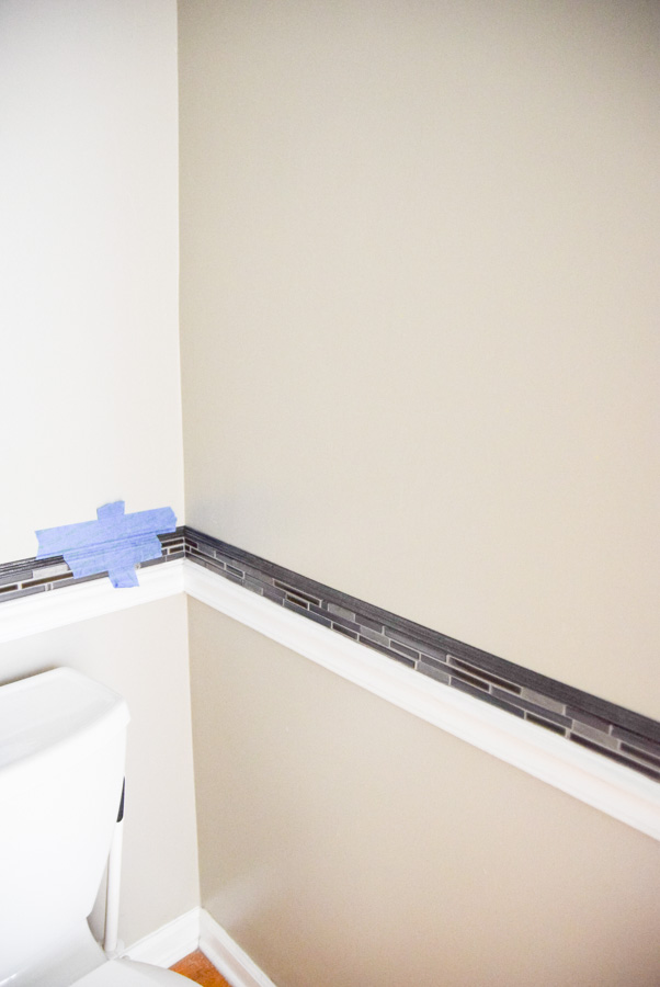
I thought we could butt it up to the existing chair rail and add some detail to the room.
We looked at numerous tile squares, pencil tiles, and edge pieces.
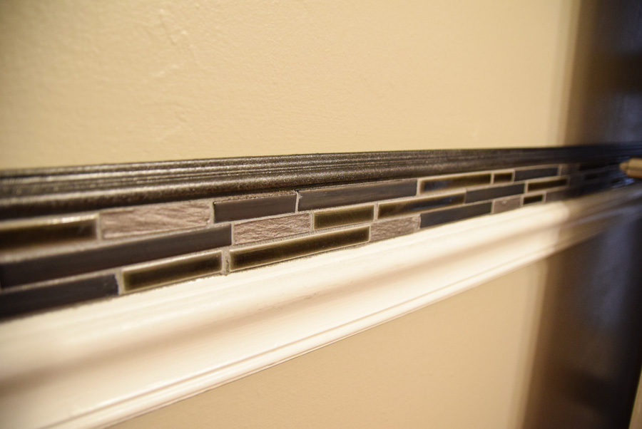
We settled upon a tile square that looked nice with the bronze and brought in some charcoal shades too.
I wanted to do basically 3 little strips together.
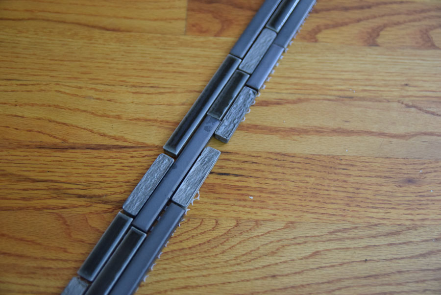
When cutting the tile in strips, I realized they didn’t fit together as well as we had hoped. I ended up laying them out on my floor to try to have it flow so when I was putting it up, so I could go from piece to piece.
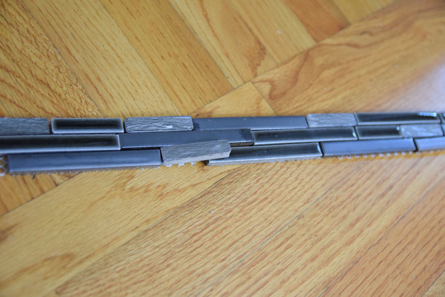
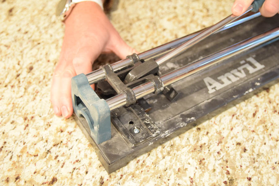
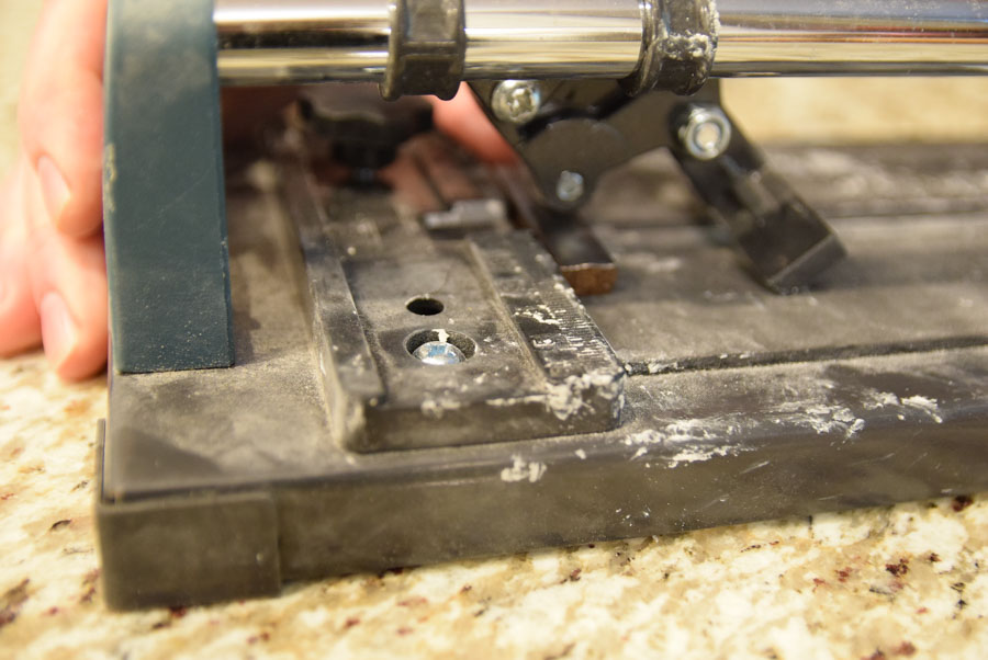
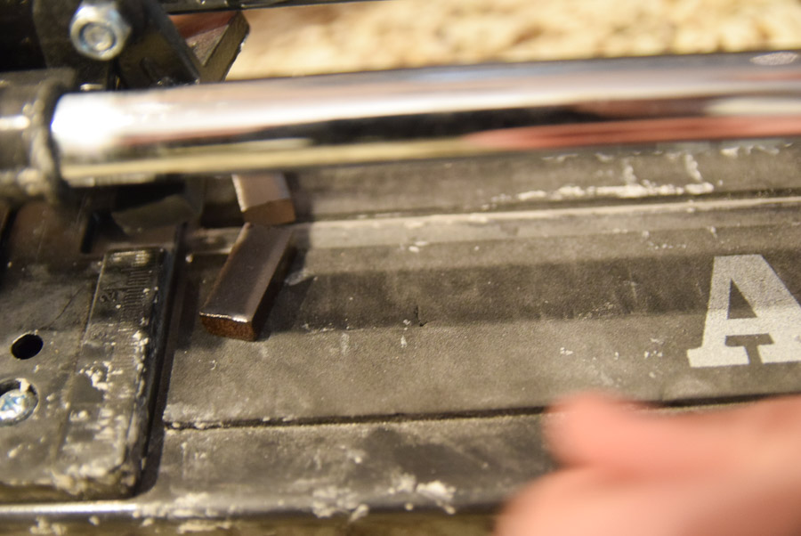
We needed to cut a few of the pieces for them to fit nicely next to each other. We used this Anvil tile cutter to make nice clean cuts.
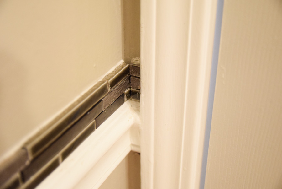
I started at the corner since I knew it would be quite visible and wanted it to look nice. Deciding whether the tiles should meet or have one side protrude slightly was a dilemma. I chose to have the corner align, as best I could, with the corner above, which meant a little wider grout line.
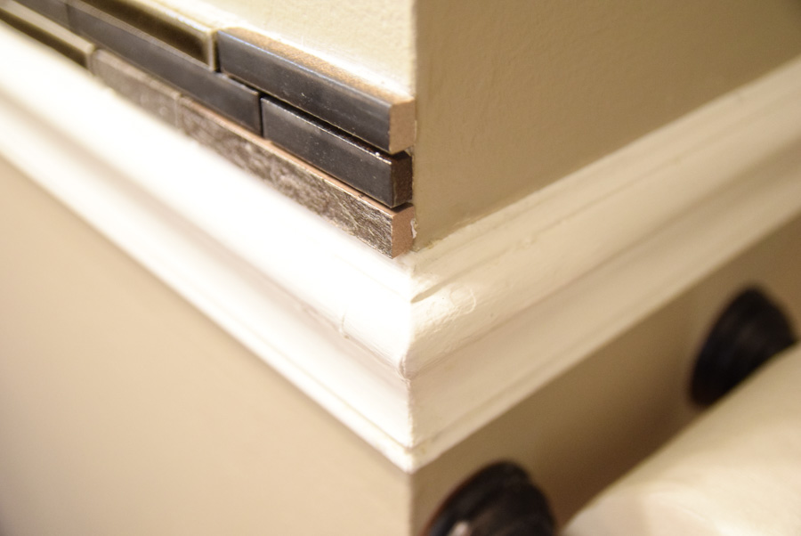
It still ended up offset a bit. As I didn’t have a way to miter the backs of the tiles to meet.
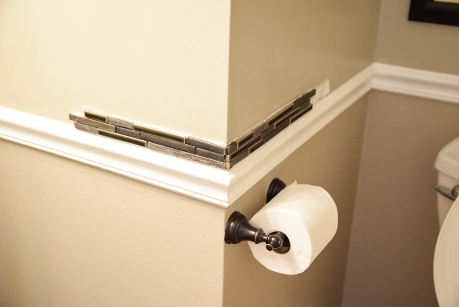
I first wiped the wall with rubbing alcohol to assure a clean surface and good adherence. I put a small amount of adhesive on the wall and did small sections little by little, since I was working alone.
If we had been doing this together, it would have gone faster and more efficiently.
I added tile sections one at a time, adding in the little cut pieces as needed.
After getting all the tiles up, and waiting a day for the adhesive to dry thoroughly, I began the grout process.
I chose a dark gray premixed grout. I’ve worked with this type before, and trust me, it’s worth the extra expense for the ease of use.
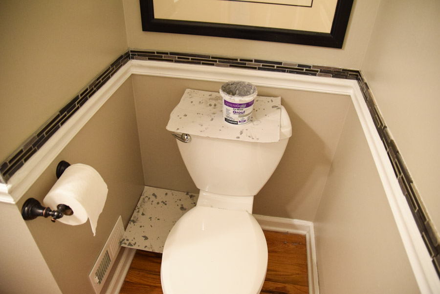
I applied this as carefully as I could with a latex gloved hand, scraping the excess as I went.
I then wiped it with a paper towel and then a sponge. I went through a lot of paper towels. I recommend having a roll at the ready as well as a tossing spot.
It is still a messy job and I recommend having something underneath the area you’re working on and sliding it over as you go.
After wiping a second time with paper towels, you end up with lots of sandy mess on the floor.
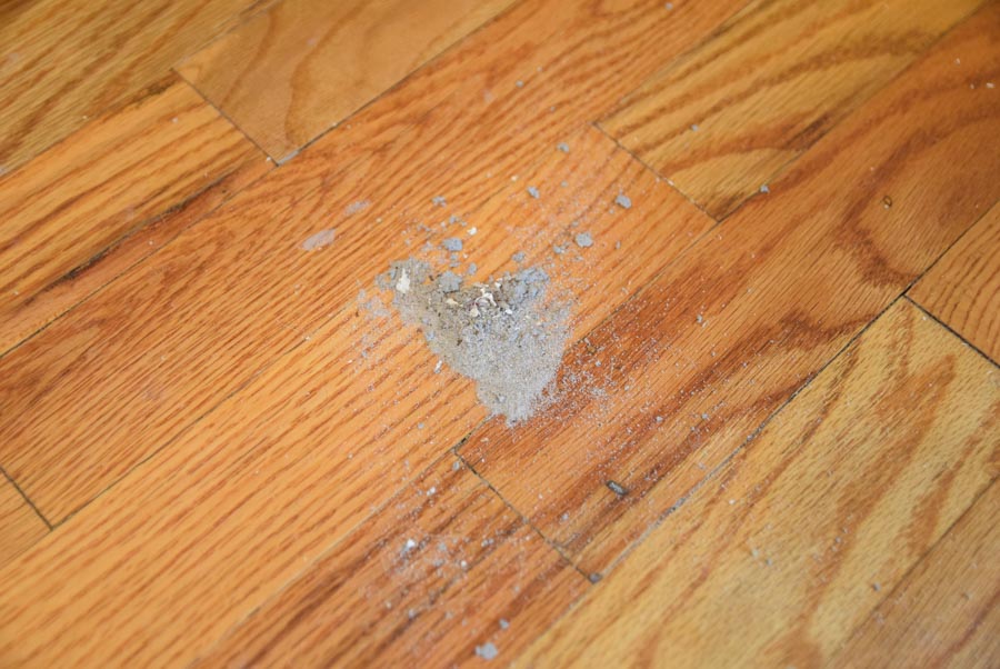
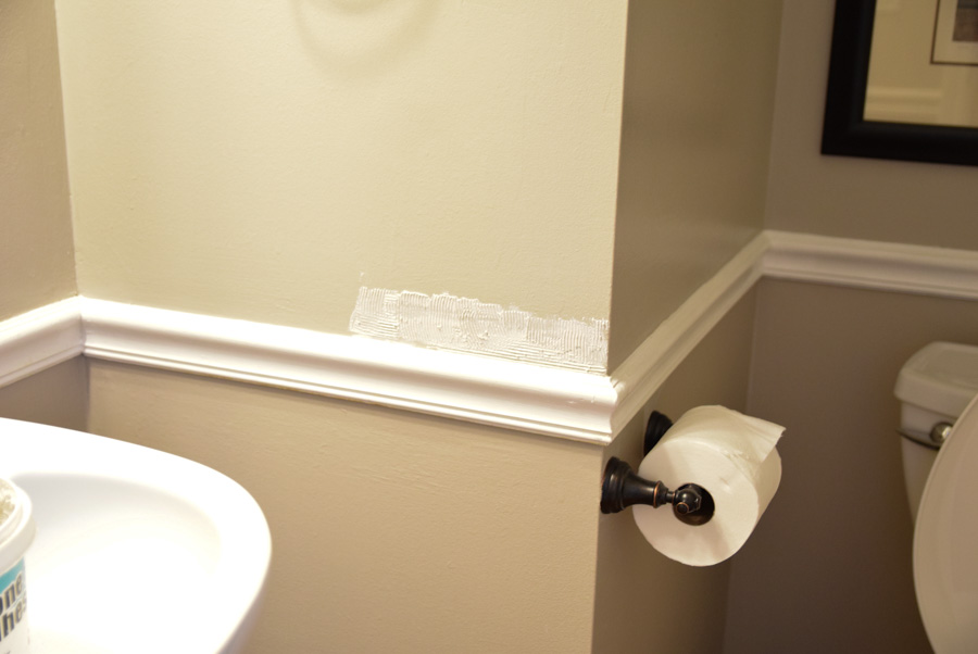
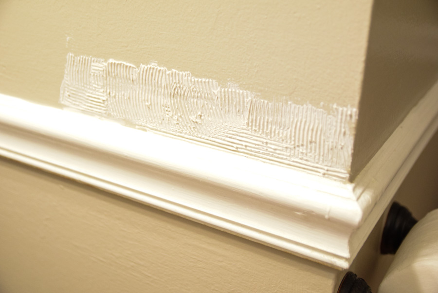
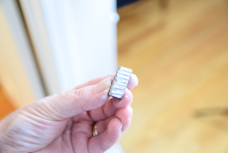
Also, if you drop it on your molding or floor, you’ll want to clean it right away with a damp paper towel or washcloth, as when it dries, it’s much harder to remove. You can see little specks of it here.
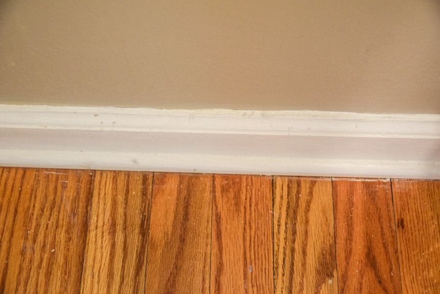
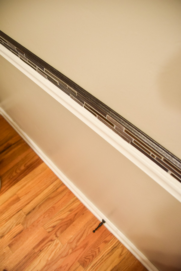
Once that part was done, I still felt the look wasn’t perfect. Some of the tile edges didn’t have a finished look.
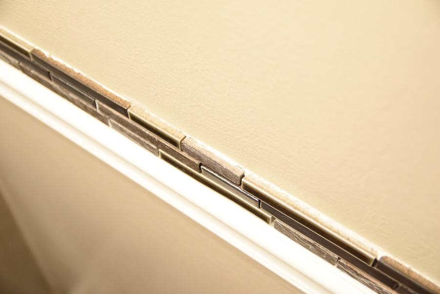
Had I made sure the most finished side was always facing the top, it may have been ok. I didn’t even notice this was something to check for.
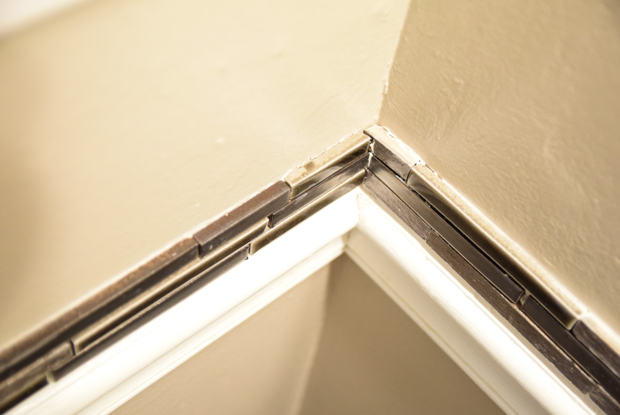
Anyway, I searched for either a corner piece of tile molding to add to the top or something to give it a more finished look. The corner moldings ranged between $2.50-$5 per foot, which would have made for a pretty pricey add on.
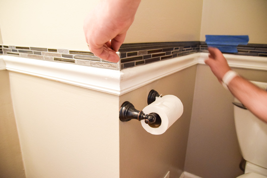
I ended up finding a piece of thin molding that my hubby spray painted with a metallic bronze and cut to fit.
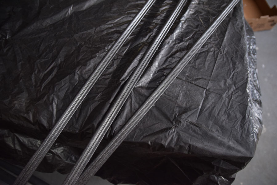
I think it turned out great! The dark tile reminded me of some old classic style bathrooms that I really liked. I was happy to have added it to the room.
He used a glue to attach the molding and held it in place with painter’s tape.
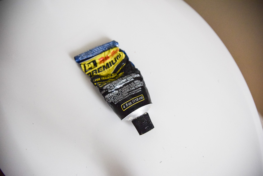
Anyway, we were originally thought this would be all we’d do to spice up the bathroom.
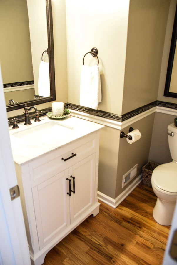
When we decided to add the vanity, thankfully the exact measurement of the top of the vanity came just below the tile. I think the vanity with the tile and the overall vibe of the bathroom turned out great. Classic and functional. Clean and fresh.
Finishing Touches
I added a candle and the soap dispenser. It still looked a little too plain.
I decided to add some spa details to give it a simple decorated look. Keeping it functional and yet stage worthy. I picked up the green from my Picasso and added some antique spice jars.
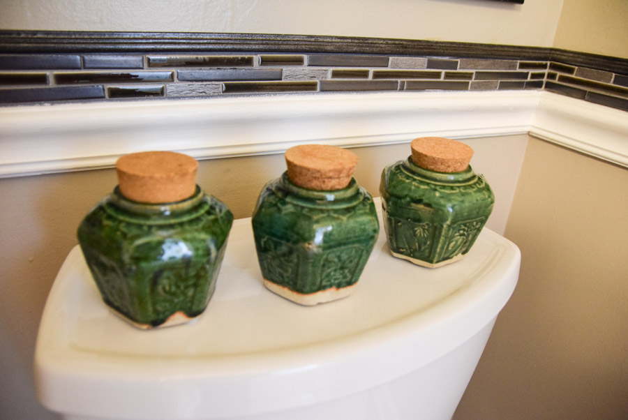
I also added a green leaf plate under the candle. Threw in some polished green stones and a succulent to compliment the look. Always a good idea to have fresh linens too!
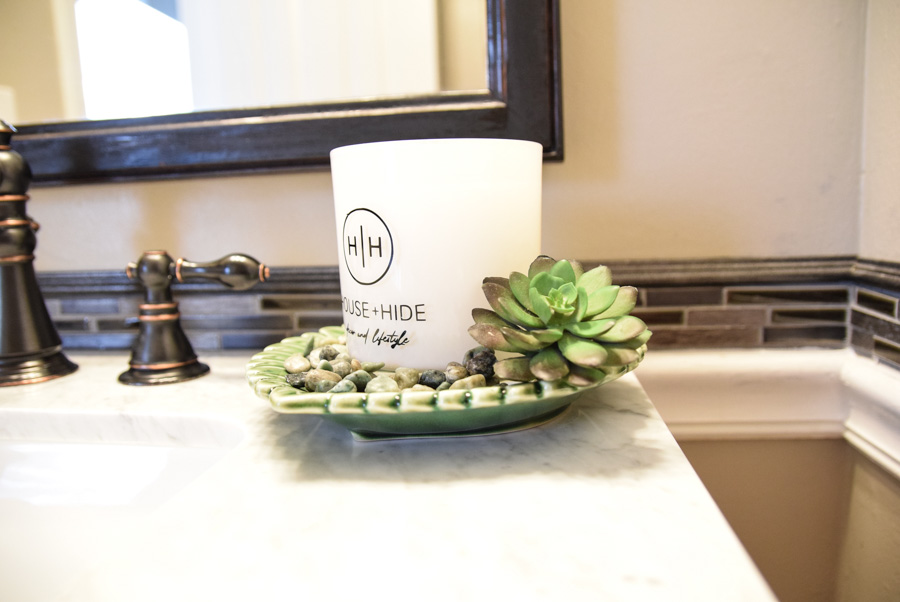
To me, the whole bathroom had classic, natural elements and a welcoming cohesive look.
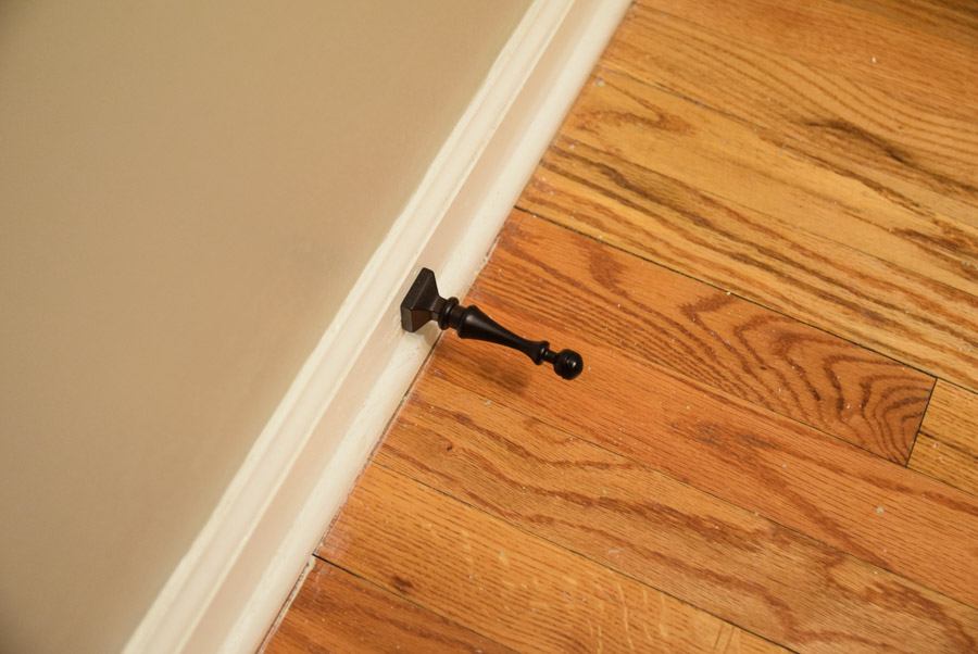
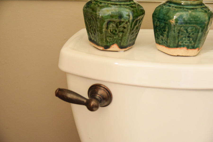
Since we are dorks, we tend to take things to a whole ‘nother level. We added a matching door stopper, and a toilet handle. Yes, we are moving, and yet, we want the next people to not have to finish a job we started.
Whether you are updating your bathroom for yourself or making your house more ready for the market, tackling this project is not an excessive amount of work. You can do things little by little and enjoy the space along the way.
Looking at overall expenses, we ask ourselves, will we get this in a return when we sell our home. If the answer is yes, and we can afford it. We do it.
In the meantime, we will enjoy our bathroom and the work of our hands.
[…] bathroom fixtures, doorknobs, and outlet plate covers. We did a few quick kitchen updates and bathroom improvements, including updating the […]