Have you ever wondered what are some quick kitchen fix-ups you could do to improve your home value and make your space look fresh and updated?
Well I can tell you what we did, and as far as our overall satisfaction goes, we have no regrets!
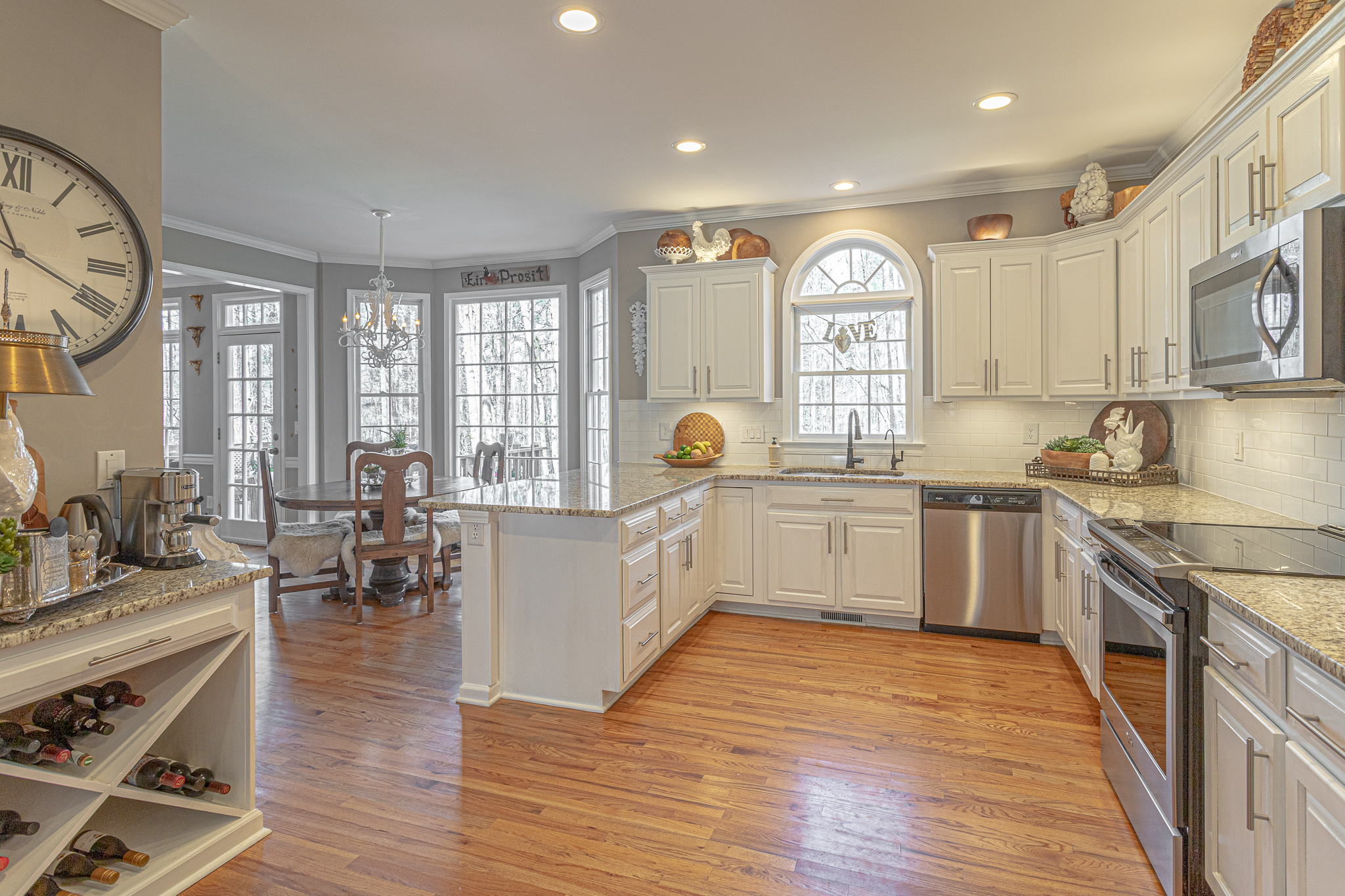
When we purchased our home, things were pretty well updated. It had fresh neutral paint throughout. The kitchen cabinets were painted white with new bronze colored knobs.
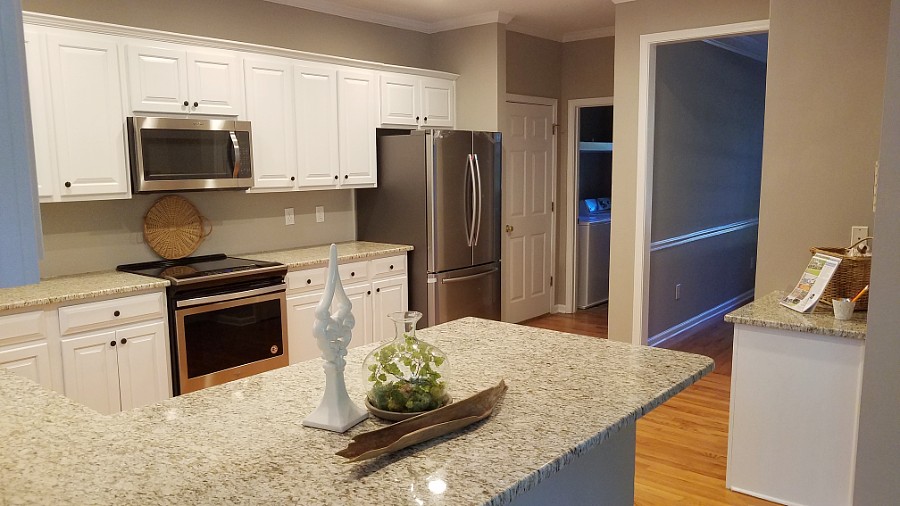
So we came into a relatively neutral, move-in-ready space, as I like to call it.
Cabinet Knobs
Even though the knobs were modern and neutral they were small and not really my personal taste.
They’re definitely an improvement of dated brass knobs which were likely on the previously brown cabinets.
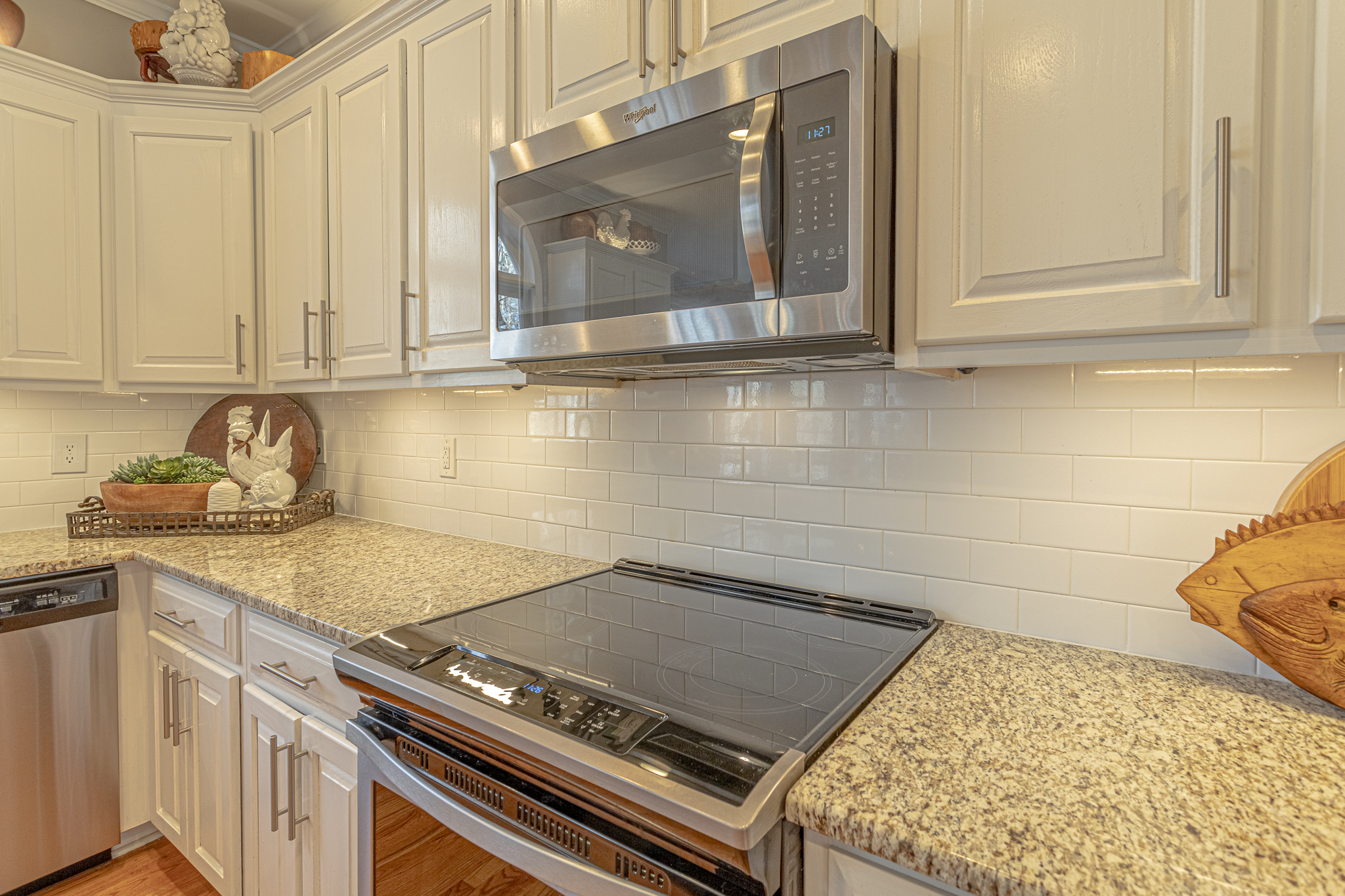
I’m personally pretty into long Euro knobs. So the first thing we did was to change this.
We looked at several options, both at Home Depot, Lowe’s and on Amazon. We ended up purchasing these off of Amazon.
They are about 7.38 inches long and were relatively inexpensive comparatively, and sold in packs of 10, for about $24.
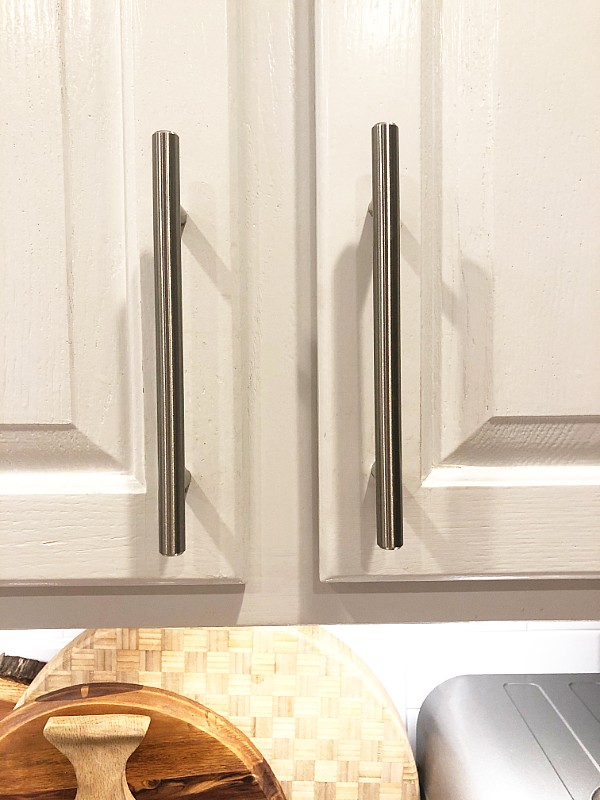
I actually like the really long ones that are close to 20 inches and brass, but they would not really fit with this kitchen.
We chose the brushed nickel as it matched the stainless steel appliances that were already in the home.
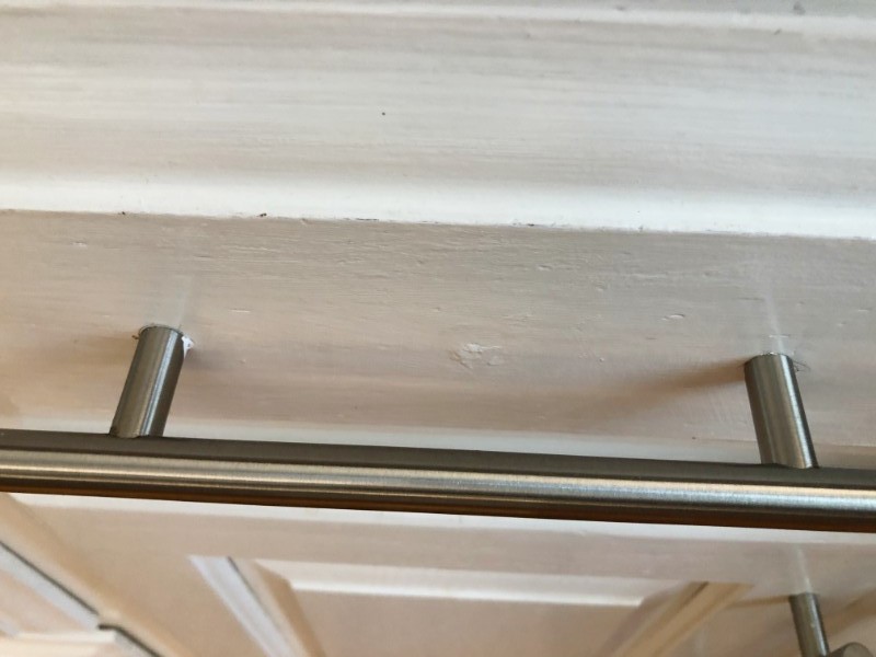
In order to install these, my hubby had to drill an additional hole in the cabinets. He used the original hole which was on the bottom corner and measured the appropriate distance up.
The drawers had a single knob in the center, so he had to drill these on both sides and we just filled the hole in with a wood filler and touched up the paint. As you can see, it was not done perfectly.
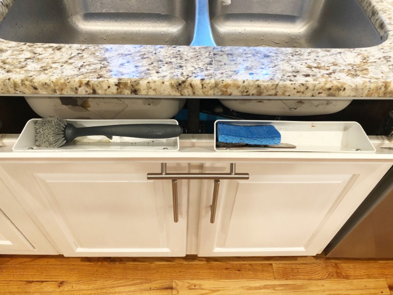
At the same time we decided to take the little fake drawer that was under the kitchen sink and turn it into an actual little stash drawer to hold my sponge and Brillo pads. Basically easy to do with little hinges and adding the little holsters.
Reverse Osmosis
The next thing we did was to install a reverse osmosis water purification system under the kitchen sink. Our water here was kind of hard and we’re used to having purified water.
It’s one of the areas we’re kind of picky about. Even though I did do a water pre-test and it wasn’t terrible, we feel better knowing we’re drinking purified water and the convenience of having it at the spout made sense for us.
We purchased an Apec water system with a five-step purification process off of Amazon.
It says it removes up to 99% of contaminants such as chlorine, taste, odor, VOCs, as well as toxic fluoride, arsenic, lead, nitrates, heavy metals and 1000+ contaminants. We’re happy with it.
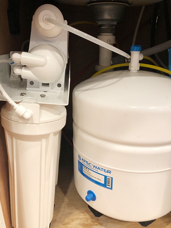
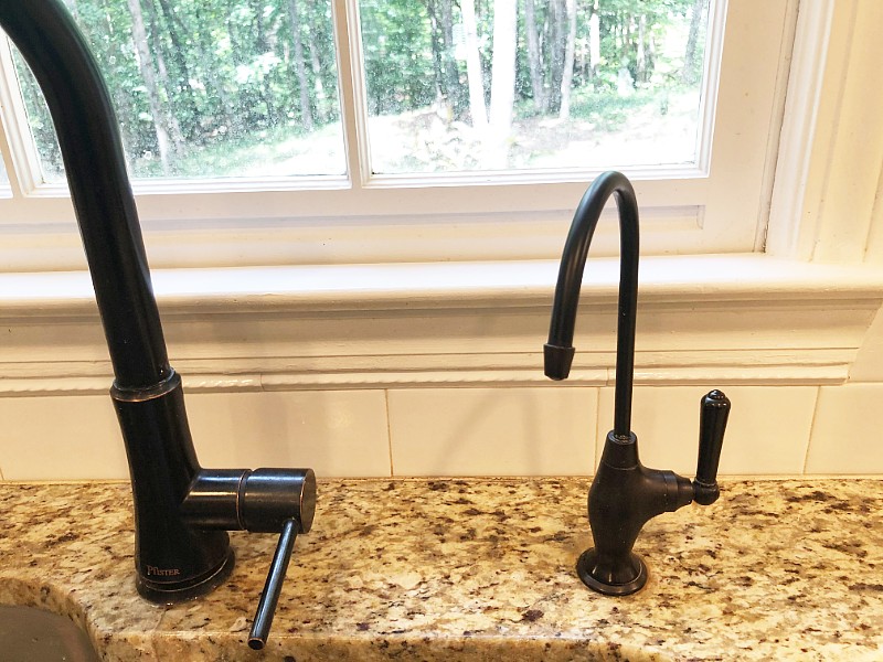
The most time-consuming part of the install was drilling through the granite countertop. It required a special drill bit and was done slow and steady and using a bit of water by keeping the faucet on a steady drip during drilling.
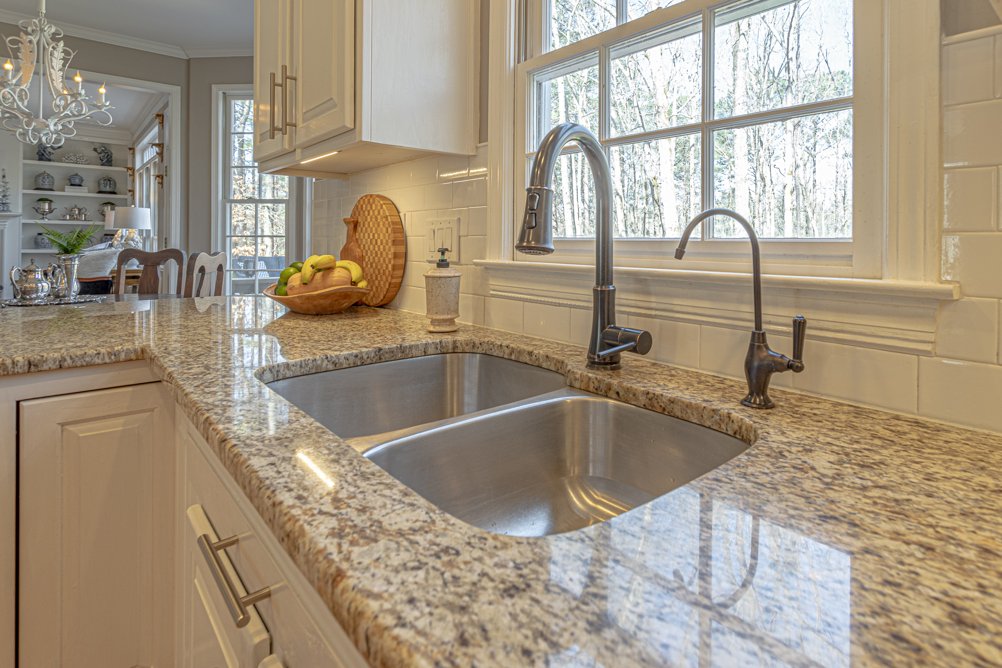
We ended up purchasing a bronze colored faucet that matched the kitchen sink faucet instead of using the stainless steel one that it came with. We wanted to be a little more matchy matchy in this area.
Wine Cupboard
The house came with a little built in desk in the kitchen, which to me usually means a messy little drop zone.
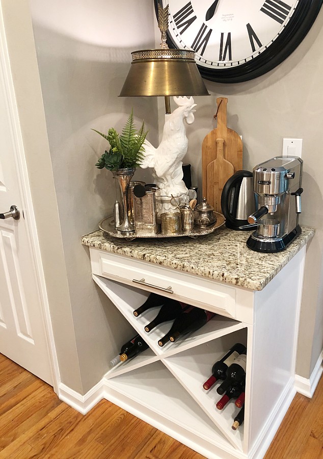
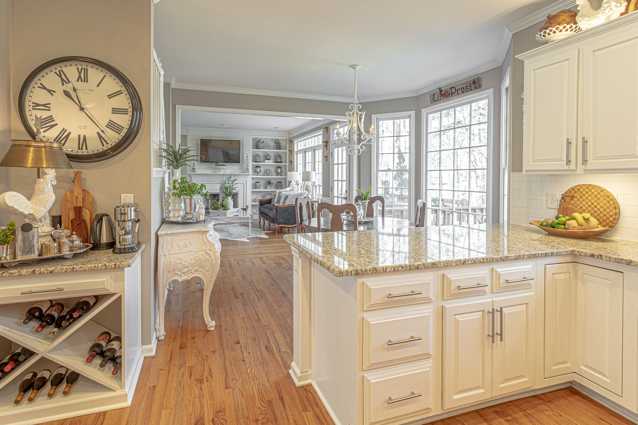
We don’t really enjoy sitting at a separate desk in the kitchen, nor do we like to have a totally messy area there, so this made for an easy decision to make it a little wine cupboard with a coffee bar on top instead.
My hubby started by measuring out the size. He figured out the angles and set the saw. He used plywood and cut a slat coming from each side so that the two pieces would fit together and form an X.
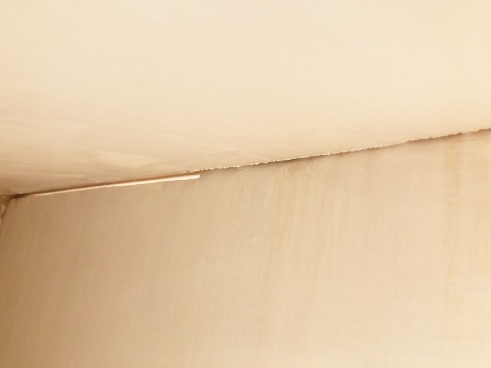
Once they were put in place and secured he caulked around the edges and we painted the area and added molding to the base to give it a more finished look.
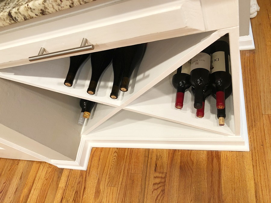
I think it looks great and it has become a focal point in the kitchen.
Upper and Lower Cabinet Lighting
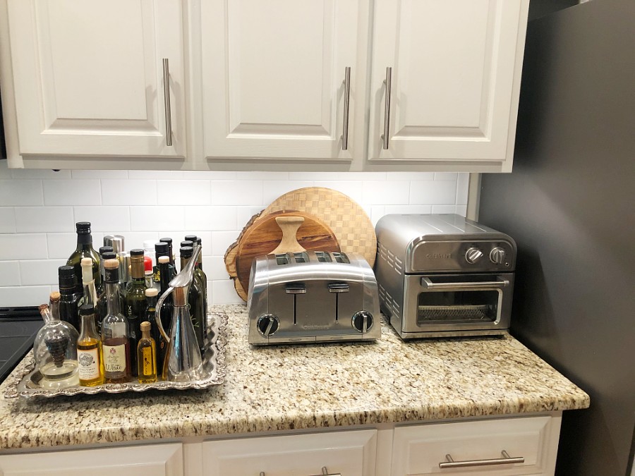
The next thing we did was to install lower cabinet lighting. The one my hubby chose is dimmable and LED. He ordered it off of Amazon.
It was a relatively easy install as they basically link together and can either plug-in or be hardwired into an outlet.
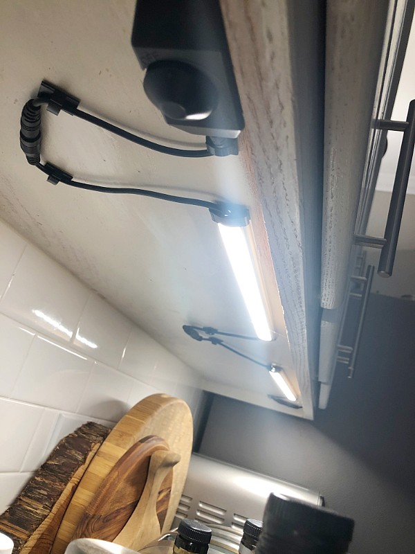
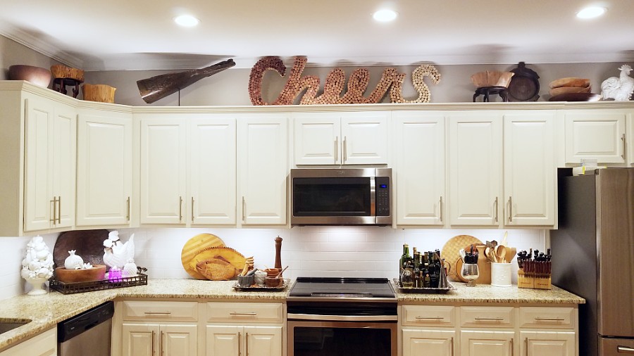
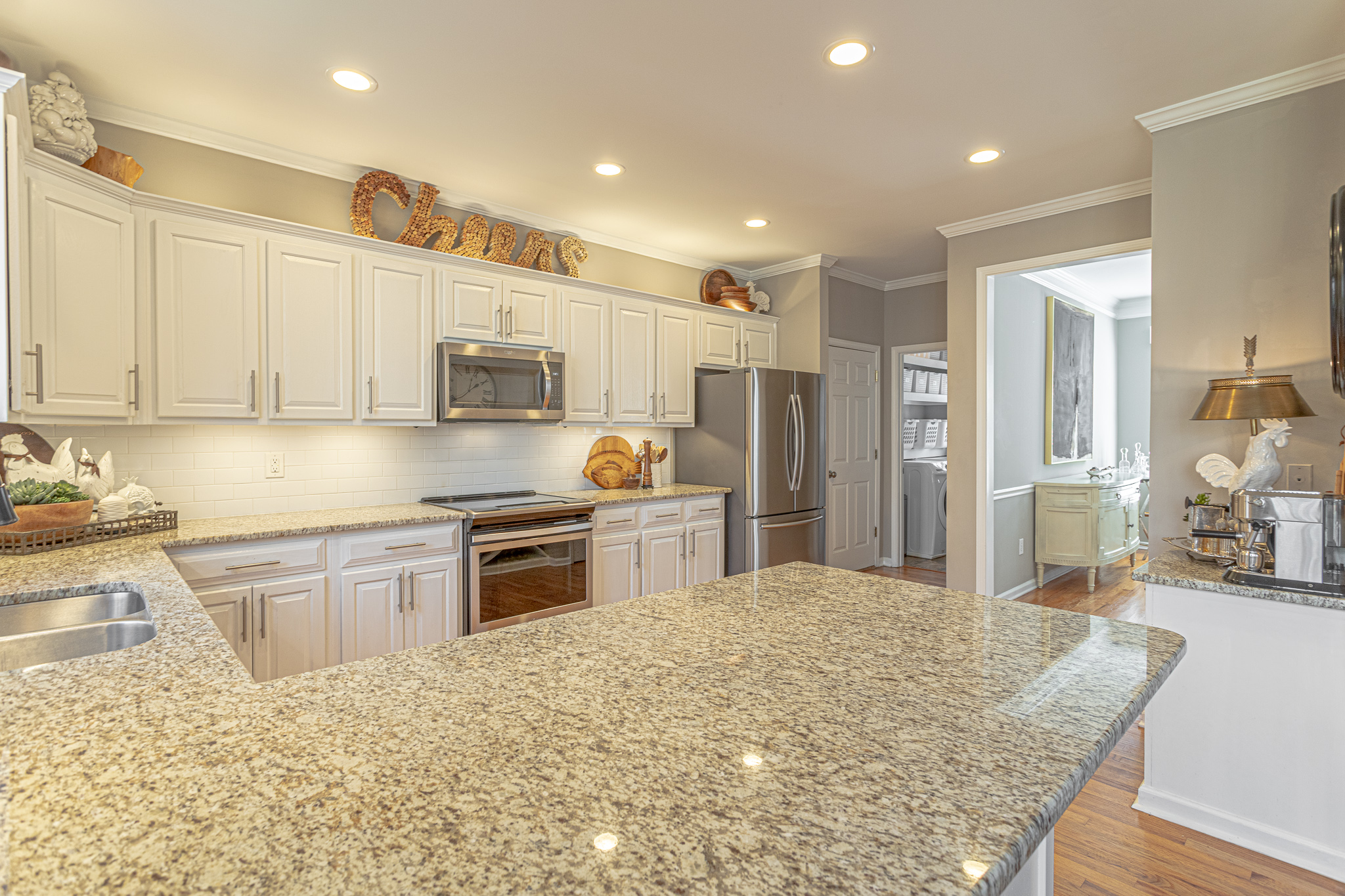
One side of our kitchen has the majority of cabinets on it, divided by a microwave. We used two sets, one going in each direction from an outlet that’s inside a cabinet above the microwave.
We use a timer so they automatically turn on and off at a particular time. We just keep them set to the dimness that we prefer and never actually touch the button to turn them on/off or dim.
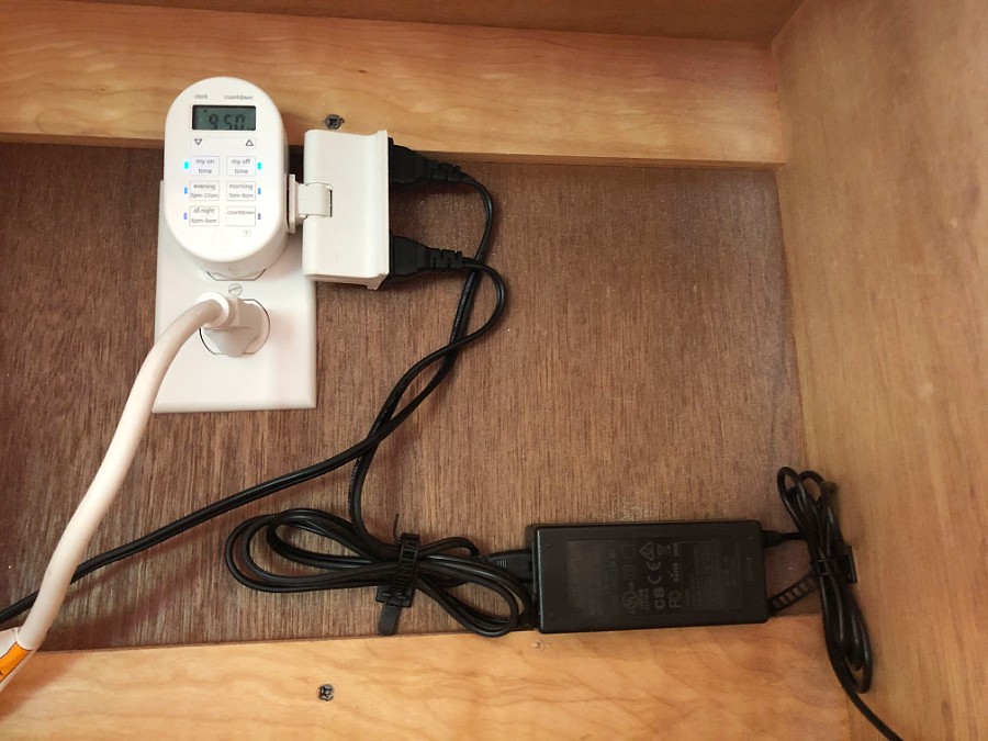
He had to drill through the bottom cupboard in order to put in the on/off dimmable knob.
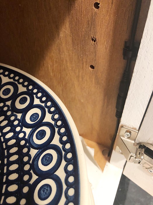
It’s hardly visible and we really do not touch it ever as they are on the timers.
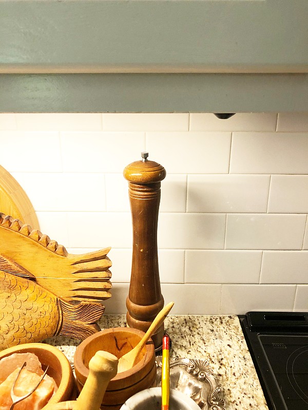
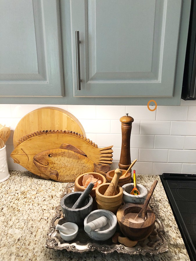
On the left side of the kitchen sink, we had a little bit more of a dilemma. We didn’t want to have a wire going across the top of the window or to have it be noticeable in any way.
This meant they needed to either be hardwired in to an outlet on that side of the sink or create another outlet. This also meant they were not part of the same timer as the others.
My hubby chose to take a two gang switch that was already there and turn it into a 3 gang switch. He then ran a wire up to the top of the cupboard and put in an outlet there. Technically, we could put another timer up there, but we just use the switch.
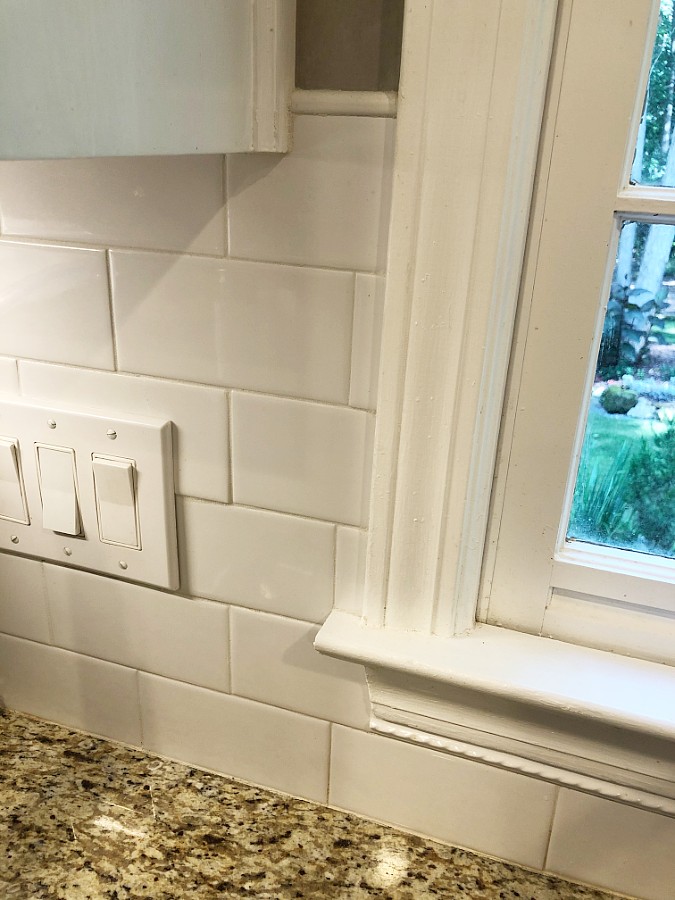
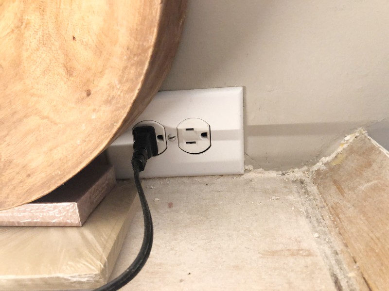
So this side of the cabinets lighting operates differently than the other side. Thankfully, it was easier to run the wiring up there without having a backsplash already installed.
We set all of the lighting to the same level of dimness. It has a nice level of mood lighting, and we usually do not run our recessed lights in the kitchen at all, unless we’re cooking. Even then, hardly ever.
We leave the timer set to on from 6 am to 11 pm daily. The lights provide such a nice ambience for our home and make it look extra special.
After we did the lower cabinet lighting, which is all we were originally going to do, we liked it so much and thought it was easy enough to install that we’d go ahead and do the upper cabinets too.
They were equally easy, if not easier to install, as they are just laying there at their correct spacing.
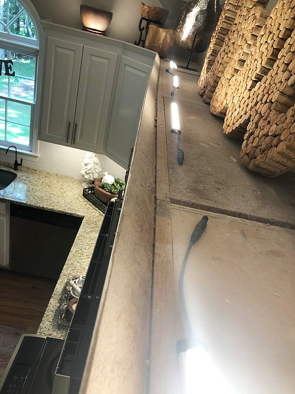
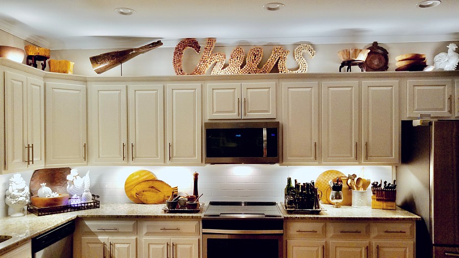
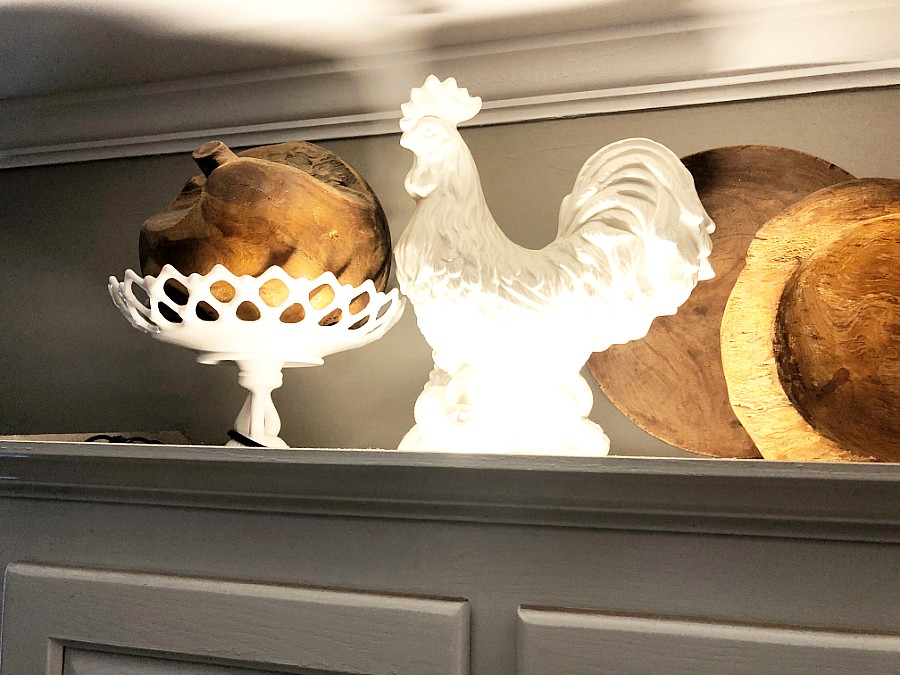
We did lay them down in logical spots and tweaked them a bit to reflect on my decorations strategically.
Backsplash
The backsplash took a lot of contemplation. There are so many varieties of tile available and it really makes for a tough decision.
It’s like going in the cereal aisle of the grocery store and suddenly you have 10,000 cereals to choose from. When we were kids, we only had around 20.
Same goes for backsplash and tile. Way too many options.
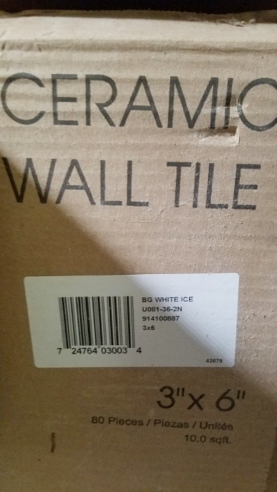
When we purchased our home they had left a full box of leftover subway tiles from the upstairs shower.
After looking at numerous tiles, which if I were really picking what I wanted, I would have picked the really long rough cut subway tiles.
I would have liked them in a herringbone pattern too.
If I had been more of a stinker, and if I really pressed it, my hubby probably would have done it.
In the end I was totally fine with just using our existing white subway tiles and purchasing one more box, which was around $20. That price point and the ease of use made these the best choice, plus they are simple, neutral, timeless, and easy to clean. They don’t detract from anything, and they go with everything!
I considered putting in a little accent point above the stove, but in looking at my kitchen and the amount of accessories that I have, I thought it would be too busy. I’m thankful to have kept it simple and plain. Another consideration is all the additional tile cuts you’d need to make in order for this to work.
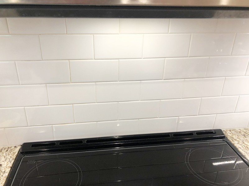
I also am glad we went from the base of the cabinets all the way to the counter instead of having an additional backsplash there. I feel that’s a little more of an old fashioned look or when adding it above an existing one, it looks like an afterthought.
In picking the adhesive for the tile, we wanted to pick something that was easier to work with. This is where I think spending the money makes sense.
If you can use something that’s going to hold the tiles in place and have them not fall off the wall, and the headache involved with that, this is the route to go.
Same goes for the grout that you choose. Have you ever cleaned a bathroom shower that’s all yucky from the grout not being sealed? The same goes for kitchen grout. Who wants to sit there and scrub grout all day?
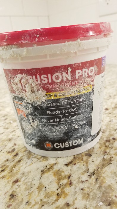
We chose to spend the extra and get the stain-resistant grout in a bright white. No regrets here!
This became a family project for us. We had all hands on deck. Once we decided how we were going to do it, we had my hubby trimming tiles to go around the outlets and cabinet areas.
I spread the adhesive on the wall using a square notch trowel to make it at the right thickness. Our daughter put the tiles on one by one doing about a 1-2 foot section at a time.
The next day, once they were dry, I would grout about a 1-2 foot section at a time and wipe it down at the same time. Our son kept rotating two plastic sink tubs of water, continually bringing clean water and dumping the old outside.
It needed to be wiped down, left to dry for about an hour and re-wiped until shiny.
We really made this work in a very efficient and assembly line style way. This is a case where indeed many hands make light work.
Under the Window Sill
Deciding what to do with the area under the kitchen window sill was a consideration. It had a board below the window sill that could be left to allow for one row of subway tiles plus a pencil trim accent piece or removed to allow for two rows of subway tiles.
I felt removing the bottom board is a more modern look.
After holding up a braided style pencil trim piece, I liked the look and thought it added some character and charm. We chose to use the braided piece.
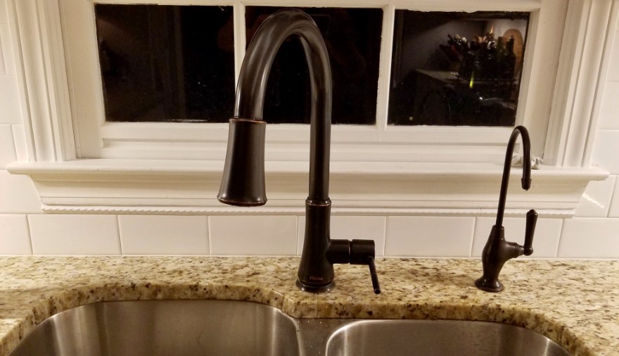
Believe it or not, this was one of the more expensive parts of this project. Not only that, but it’s tricky working with these little pencil-sized pieces of ceramic, as they are very fragile, and break easily.
When you’re cutting them to the proper size, you need to use extra care. I think we ended up breaking a couple of them and they cost about 5 bucks a piece.
Where To End The Tile
Deciding where to end the tile, in a couple of different areas, was also the subject of debate. I wanted the tile to go up on the sides of the window all the way to where the arch began in the upper area of the window over the sink.
In order to do that we would have had to cut a whole bunch of little pieces of tile which seemed like a lot of extra work.
We chose to go across from the base of the cupboards, where the tiles met the cabinets, and brought that line straight across where the window is.

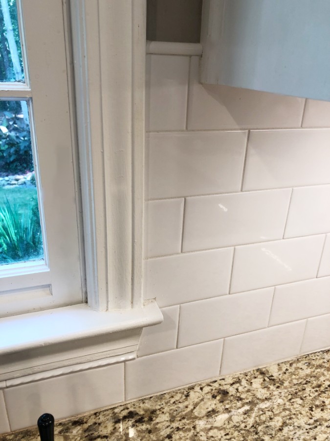
On the left side of the cupboard where the counter overhangs and almost has a breakfast bar area, we chose to bring the tile straight out and straight down ending at the wall seam.
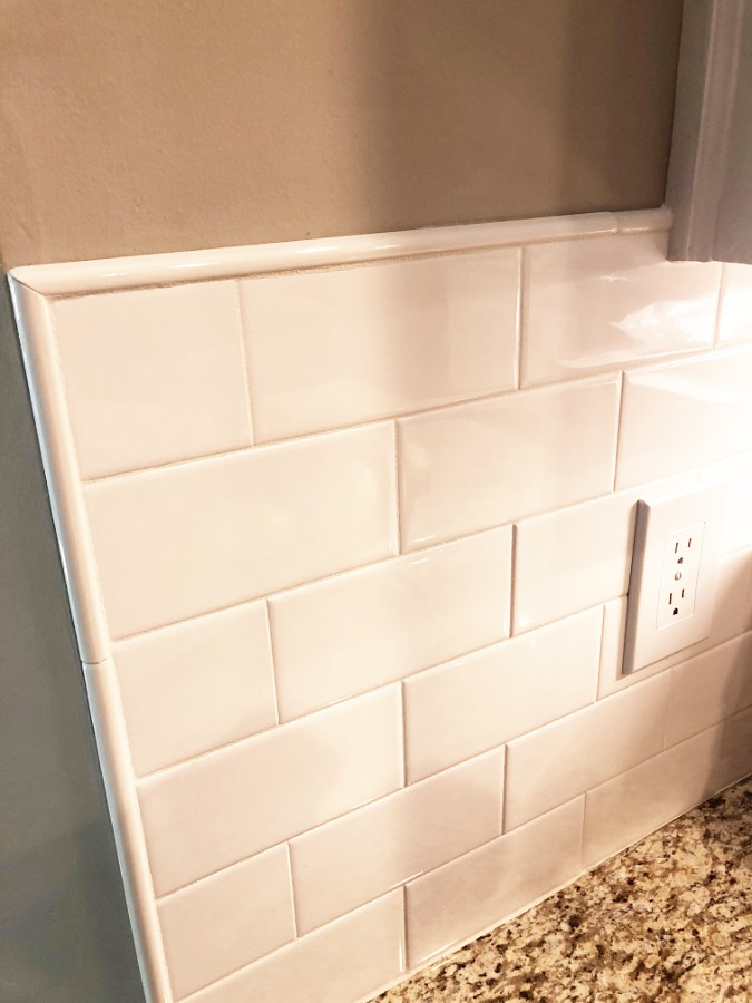
My neighbors had their kitchen redone professionally, after we had ours done, and they had the workers create almost a step in the tile. It came down from the cupboard and then over to the end of the counter.
I prefer our method of going straight across compared to this little extra step in her tile. This is a personal preference, so do what you like, but do consider it, when you are doing this project.
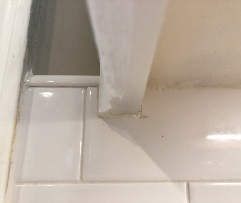
On the opposite end of the tile, which is where we began, next to the refrigerator, we felt we wanted to go straight down from inside of the kitchen cupboard to the countertop. After we placed the tile coming to that edge, looking at it from across the room, it looked like it went too far in from the top on the counter.
It really did not look right to me and I couldn’t get over it. I looked at different tile edge pieces that I could potentially use to extend it and they still seemed either too wide or too narrow.
In the end my hubby took one of the subway tiles which are approximately 3 by 6 inch size, and he cut it straight down the center lengthwise. We used those pieces to extend the tile on that edge and added grout to the corner.
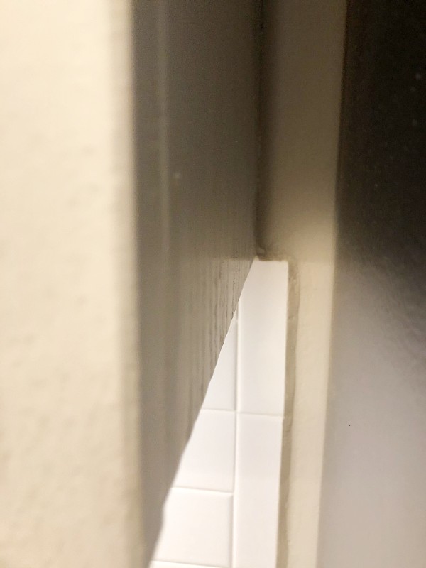
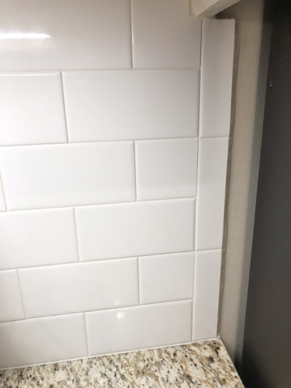
If we had added the little pencil pieces to that edge it would have taken it out too far after doing it this way. This is an area I wish we had planned a little better and held up the tiles and looked at it from further away before we had begun.
I don’t think it’s very noticeable, especially not where it’s located, but if I were starting the project over, it would have been a consideration.
Grout
There’s a little area above my stove that has a steam hole. Over time, I feel the steam could discolor the tiles and grout.
The grout that we chose to use does not stain at all. I just wipe it off. I’m so thankful that we didn’t buy the cheaper grout. This was also a much easier product to work with as it’s premixed and ready to go.

Faux Island
I can see my kitchen while sitting on my couch in the living room, as they flow into each other. We never use the counter area as a breakfast bar as the house isn’t that large, and with barstools, the area would look even more busy. I already have way too many accessories in my kitchen so it’s nice to have this area look a little bit simpler.
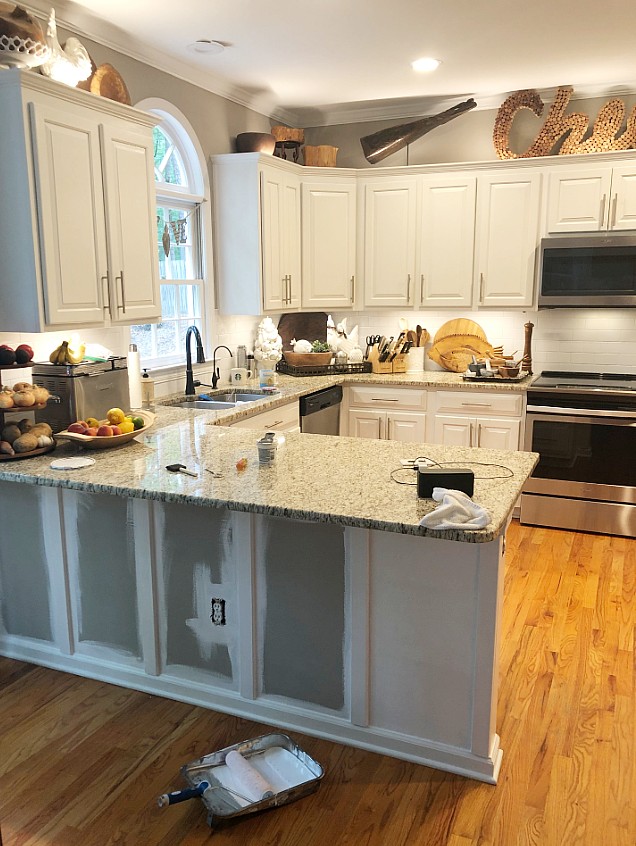
Looking over at the kitchen, I thought this area could almost look like a faux island if I changed it up a bit from the wall paint. I thought that If I made it match the cabinetry more, it would give a cool look.
I decided to add boards under the counter to match the lines of kitchen cupboards. Painting them white instead of the gray would mimic the cabinet facings. It could almost give it an island look at a glance, which I feel is a more current look.
We chose a board that was similar to the size and look of what the cupboard edge looks like. Ours are spaced a little bit further apart than the kitchen cabinets, but they blend.
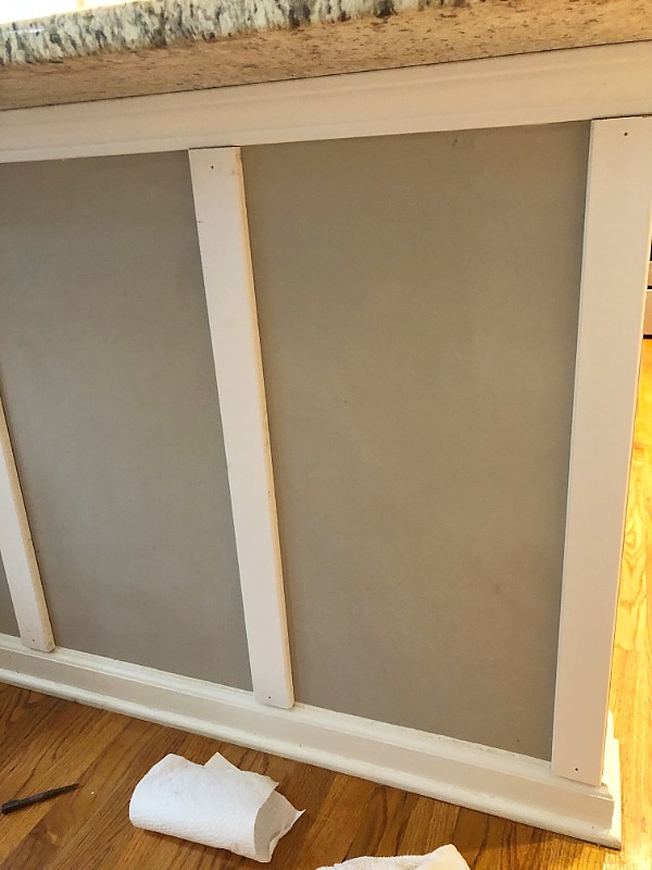
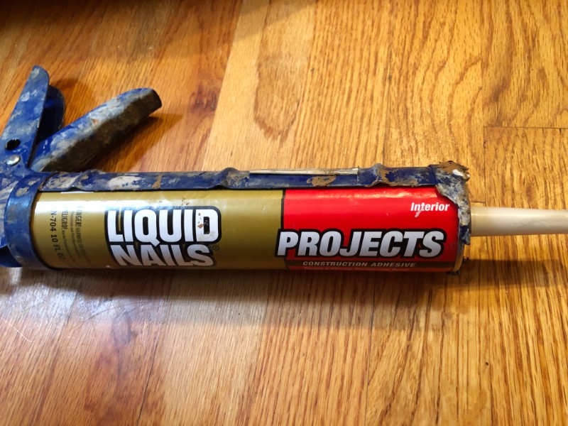
My hubby put them up using glue and finishing nails.
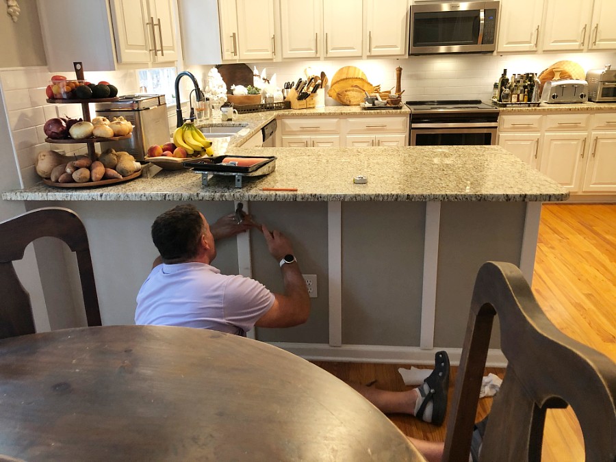
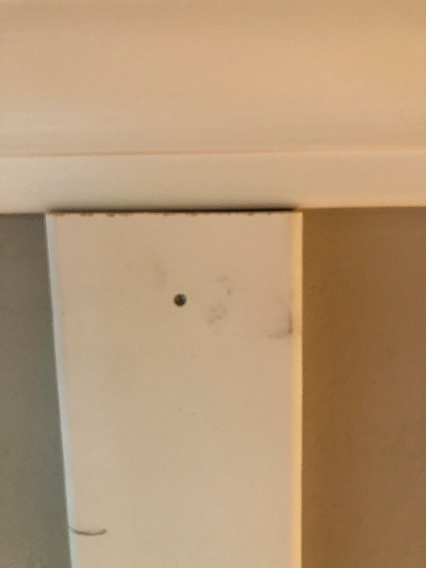
I then filled in any divots and painted the area to the matching cabinet paint.
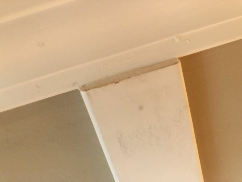
We added a trim piece to the area where the outlet comes out to make it match.
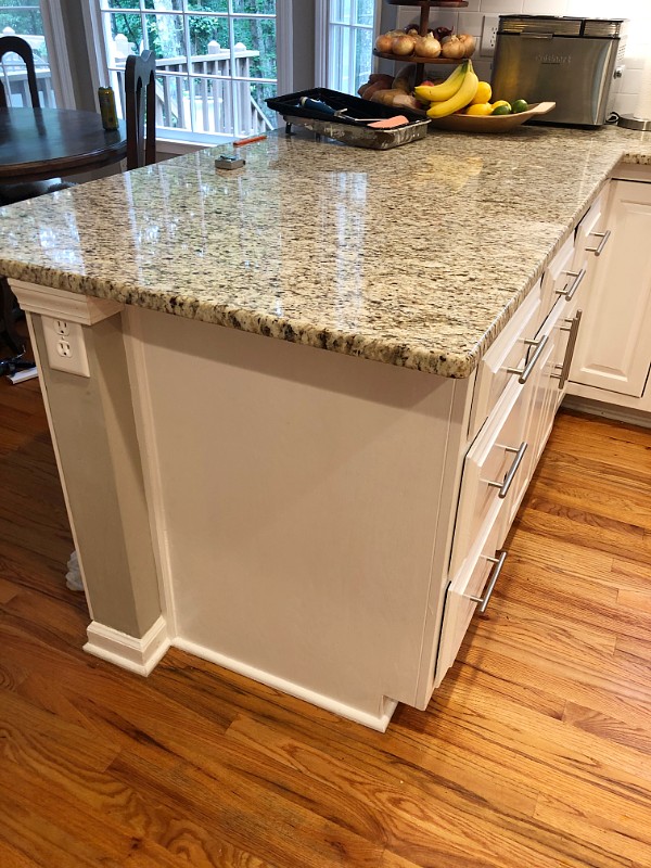
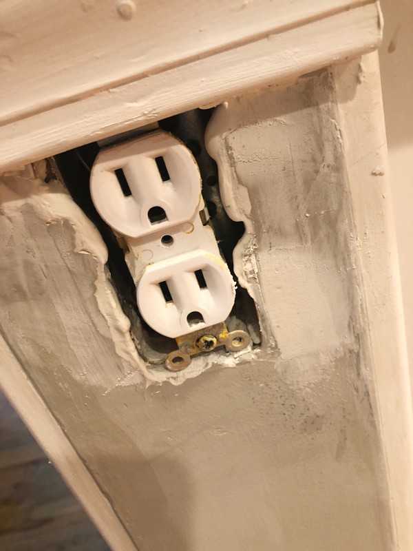
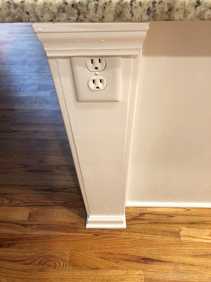
I think the overall look brings harmony to the space and gives it a more modern look of having a faux style island instead of a closed kitchen.
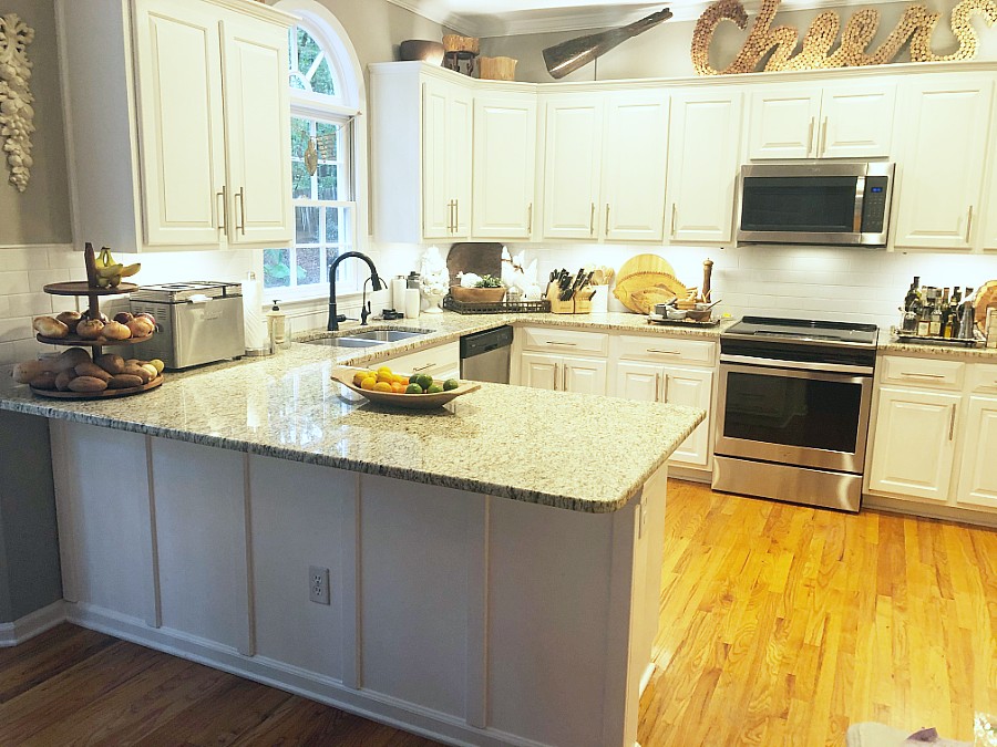
When one is looking to sell their home, they are looking to make an impression. You want to separate your house from the other houses that are in the running to the buyer.
In order to give yourself a leg up and be the chosen home, sometimes updating with an appeal to the masses, gives you an edge.
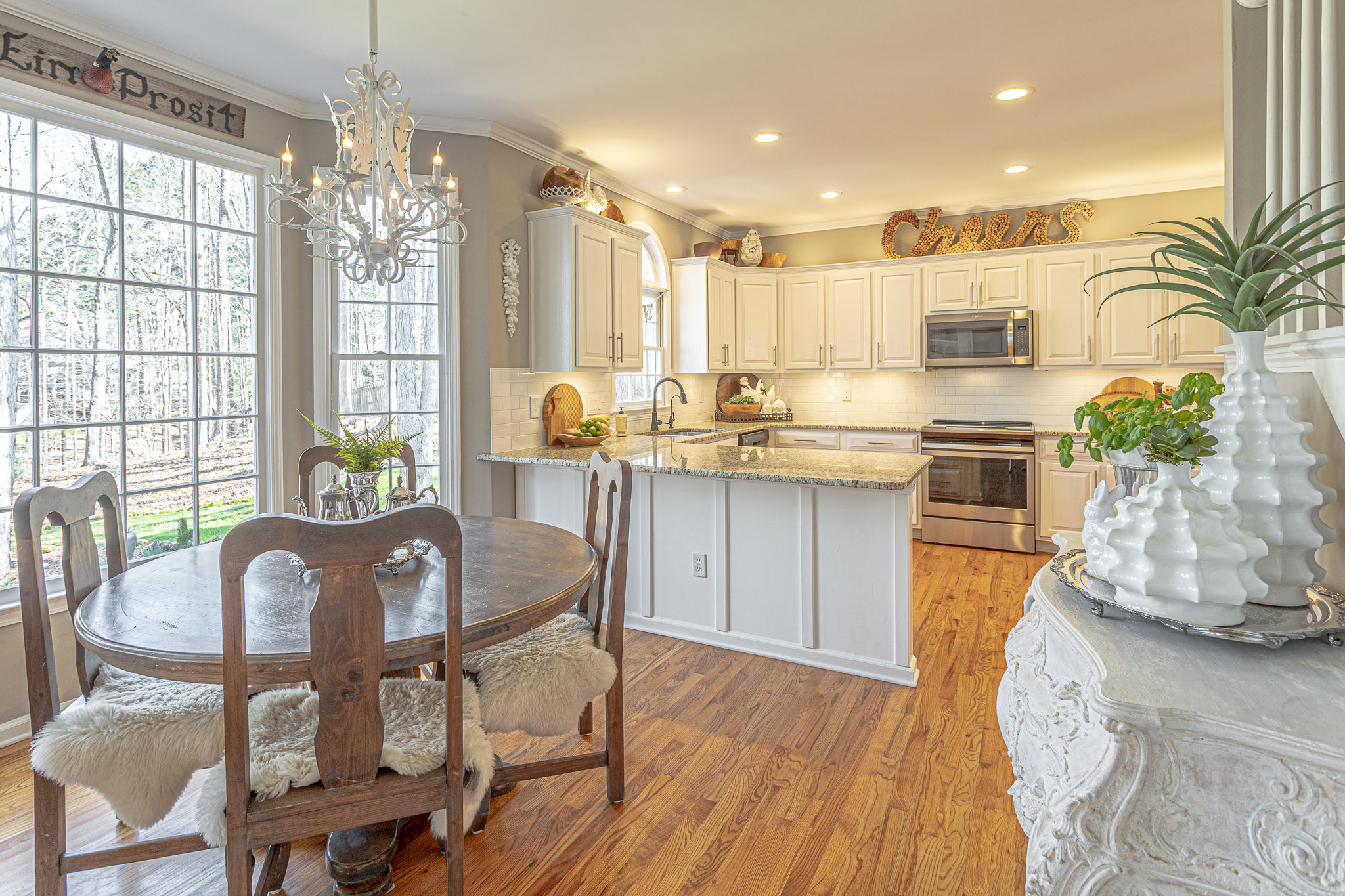
Of course cleaning and painting the walls would be first. These are some additional quick fixes that are relatively low cost and are not a complete renovation. They can also be done over time and enjoyed by you while you are living there too.
Have you tried any of these fix ups? What other recommendations do you have for getting your home ready for the market? I would love to see the projects you’ve tackled too. Happy homemaking!
[…] installing updated lighting, bathroom fixtures, doorknobs, and outlet plate covers. We did a few quick kitchen updates and bathroom improvements, including updating the […]